Saturday, June 13, 2015

What's new in lighting direct from Maison & Objets Americas !

Maison & Objets, the renown Interior Design Trade show made it's American debut last month.  It literally lit up Miami with the most innovative and creative lighting ideas.

There were charming lamps, fabulous sconces, and dazzling chandeliers.  Artisans created the most intriguing fixtures out of everyday materials.  Here is some of the lighting that still shines in my mind even weeks later.

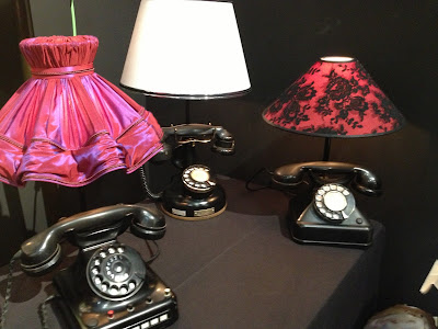
Do you have an old radio, clock or vintage telephone gathering dust in the attic?  Add a retro fabric covered shade and turn them into a statement making lamp like these.


Delicate laser cut designs in leather became beautiful lamp shades for these lamps.


Years ago turned wood spindles were used to fashion book cases and tables.  Now an artist from Paris gives them  an updated look creating furniture, lamps and colorful sconces.


The silk hand made pleated shades made the light from these lamps glow.


Speaking about glowing, the new chandeliers by Allison Paladino for Fine Art Lamps were fabulous.  They looked like illuminated chunks of crystal.


 I missed meeting Allison ... it would have been so interesting to learn what inspired her to create this collection.  But I did meet the artist who fabricated this beautiful light.


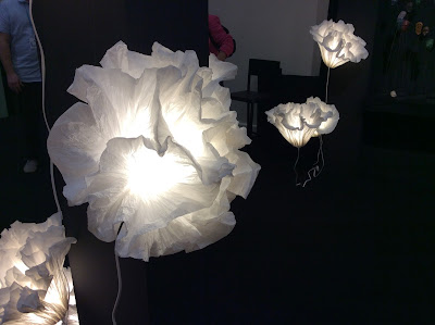
This started out as a piece of parchment paper.....the artist showed us by unfolding one of the lights and it really was just one piece of paper.  Incredible!  It reminded me of the crepe paper flowers that were popular in the '70s.

Another artist fascinated us by demonstrating how a box of pieces of natural wood veneer could become a contemporary pendant fixture like these you see below.


A ribbon of brass becomes a beautiful wall sconce.


What do you think this one is made from? It reminds me of coral under the sea.


The image of this sconce looks like an agate taken from the earth. Can you tell which is the agate and which is the sconce?

Image result for agate slices


Some of the fixtures were like jewelry for your walls like this brilliant sconce.


Some of them were just mesmerizing.  Doesn't if almost look like it's on fire?


Can you spot the little hand blown glass humming bird perched inside this etched glass dome?  This chandelier was adorned with them on the end of each arm.  


They were stunning individually but as a large fixture the result was not as appealing.  Too much of a good thing is too much of a good thing.


But this chandelier was spectacular.  The "crystals" hanging from these arms were made of bronze!  They were beautifully crafted.  Holding one in my hand made me realize how incredibly heavy an entire chandelier must be.  (Then I spotted the steel structure that was supporting it.)


A picture simply cannot not hold a candle to seeing it in person.

My eyes were dazzled and my thoughts were inspired by all there was to see.  I hope you found some inspiration along the way too.  Will you take a vintage treasure and turn it into a lamp?  Will you look at a piece of parchment paper in a new way?  Perhaps an old chandelier might be the beginning of something new.

As always I invite you to share your experiences and ideas in the comment box. Why don't you email me (at the address below) a photo of the most interesting light fixture you can find and I will share it on this blog.   I look forward to hearing from you.

Happy Decorating!

If you would like assistance with a decorating project please contact me at pictureprettyint@aol.com 

Monday, May 25, 2015

Maison & Objets Americas brings Paris to our backyard.

Did someone say Paris?  Yes, the acclaimed Maison & Objets Design Fair for the Interior Design trade set sail this month for it's debut in Miami .  Previously M & O was only held in Paris.  It was exciting to be able to get a taste of this incredible event right in my backyard.

Trussardi greeted us as we entered the exhibit hall.  This Italian Fashion House now has it's own furniture line called Trussardi Casa.


What's different about this sectional? I think it is the way the back cushions are made to look like toss pillows.


The creativity was dazzling and inspiring.  The light fixture  below is nothing more than a piece of parchment paper crinkled up by the hand of a talented Junior Fritz Jacquet who creases and molds sheets of paper and cardboard into stunning works of art all without the aid of cutting or pasting!


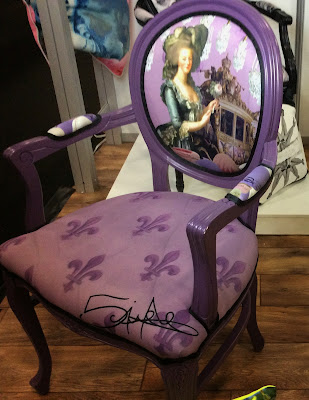
Look at what artist Corinne Campenio did with her art.  You have heard of "wearable art"? This art is "sittable".


The show was so full of amazing ideas it will take more than one post to share it all with you.
 Furniture was a big part of Maison & Objets. The vendors came from all over the world. It was a sort of mini world tour.  I was fascinated by the many fabulous chair designs so that is where we will start.

If this colorful chair reminds you of a carnival, maybe that's because it was crafted in South America by award winning Colombian designer Ramon Laserna!
It is made from string.

A furry little chair like this would add texture, softness and a bit of whimsy to any room.


It was interesting to see how many different type of materials could be used to fabricate a chair. This was not the only furry one.  A little chair like this would add texture, softness and a bit of whimsy to any room. How do you dress up a powder puff chair? Add crystal legs!


I think I remember lacing pieces of leather together when I was a Girl Scout.  What a creative way to design a chair.
In fact this could be done on an old chair frame as a way to recycle it.


Sleek, natural, and organic but elegant, this pair pleases the eye as well as the seat.


 The chairs below, looking a little like a Jeff Koons sculpture, seem to be in direct contrast to the one above, but they are equally as fascinating.  The Bibendum Chair by Toni Grilo combines engineering with design.


The Line Chair also designed by Toni Grilo for Rulic, the Portuguese contemporary furniture brand, is brilliant in gold.


Speaking of organic, this outdoor chair feels very earthy.  It would blend right into the scenery of any garden. Opiary fabricates everything from recycled materials here in the United States.


These polished brass and satin chairs from Koket make a strong statement.  Even though this setting feels traditional their style is contemporary.  Notice they one have three legs!


If formal is not your look Maison & Objets has something for everyone like the brightly colored pieces below by Fermob, the French ourdoor furniture manufacturer. These would be fun on a balcony, by a front door or in a bistro. Where would you like to see them?


Here is a different approach to an upholstered back chair.  Why not upholster the frame instead of covering it with a pillow?  In fact American Designer Barry Dixon has also incorporated that style into his collection.  What a lovely simple shape accentuated by covering it with fabric and outlining it with welt. Could you see this chair in white with black cording?


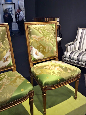
You may have remnants of fabrics left over after completing a decorating project.  Here is one way to put them to use.  Isn't this pair striking?


This dramatic couple outshines most with their bright gold finish. I felt like some of the designs were more art than a functional piece of furniture.  Don't you think these were meant to look at more than to take a seat?


What came first, the shelf or the bar stool?  Does this inspire you to look at an old chair with broken legs in a whole new way?


Have you ever seen a chair wearing toe shoes?  Well, now you have! 


What is so much fun about going to a show like Maison & Objets is we get to experience the talents of designers and artists from all over the world.  From the most elegant to the most unpretentious, each stood out in it's own way.  Every time I started down an isle I couldn't wait to see what popped out at me next.   

I hope you enjoyed this collection of The Chairs of Maison & Objets of the Americas.  Maybe it has inspired you to get creative, to upcycle something old or take your artistic talents to the next level.

As always I invite you to share your experiences and ideas in the comment box.  I look forward to hearing from you.

Happy Decorating!

If you would like assistance with an interior design project please contact me at 

Saturday, April 18, 2015

Palm Beach Red Cross Designer Show House: The Upstairs Tour

La Florentia, the house that was selected to be the 2015 Show House will celebrate it's 100th birthday in just 10 years but being part of a birthday is not new to this home.  In 1954 it was dubbed The Birthday Cake Castle because it was given as a birthday gift from the new purchaser to his wife.  The castle-like turrets and the thick stuccoed walls resembled a cake like structure and so the name has endured.


La Florentia was charming and full of inspiring ideas created by all 20 Interior Designers.  It was a true blend of the old, the new and the unexpected.   At the end of the  previous post I mentioned there were three staircases and surprises at the top of each one.

Up the back staircase we found what was most likely originally quarters for the cook or the staff.  It had been transformed into a charming eclectic guest suite with a fabulous view.


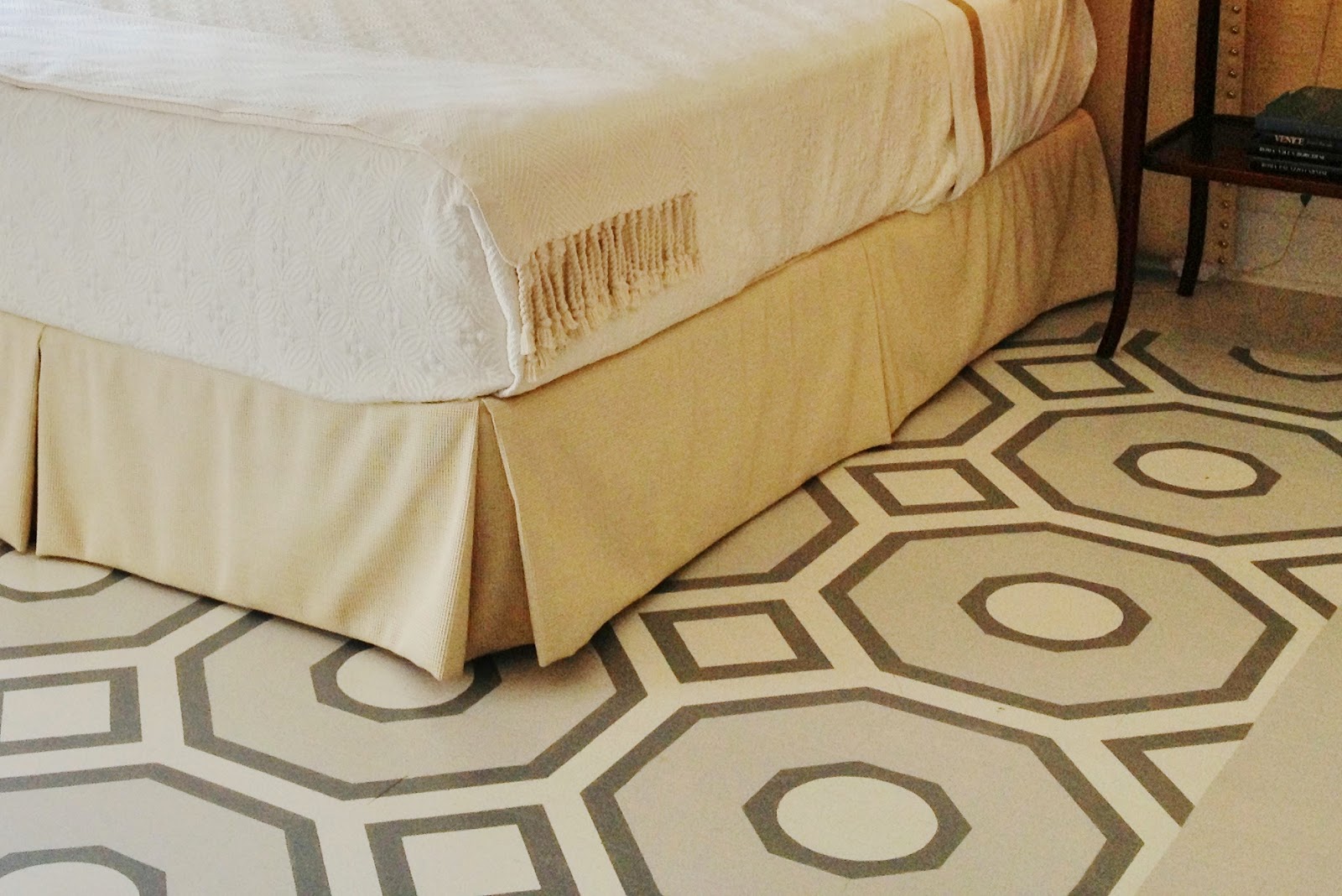
Upholstered panels behind the headboard add a modern feeling and drama to the sleeping side of this room but the bed is otherwise understated.  


The "area rug" underfoot is actually a beautifully designed and executed painted floor.  What fun!


In the sitting area the designer used a combination of a tailored sofa with contemporary tables and chair giving the room an interesting mix of styles.


Placing a small  area rug over the larger "rug" not only adds another layer but helps define the conversation setting.  Orchids are a great way to introduce a pop of  unexpected color.

With a view like this and a balcony for lounging what guest would want to go home? 


 Another staircase lead us to The Old Master Bedroom, but it was much more, with a few surprises of it's own.  Again the bed was simply dressed but so inviting.  A coffee table at the foot of the bed forms a type of footboard but with the added function to hold books, flowers or maybe a breakfast tray.


Opposite the bed the fireplace offers a place to sit or warm your toes.  The formal balance of a pair of windows, a pair of chairs and a pair of sconces as well as a pair of white orchids creates a more formal but still appealing grouping
.

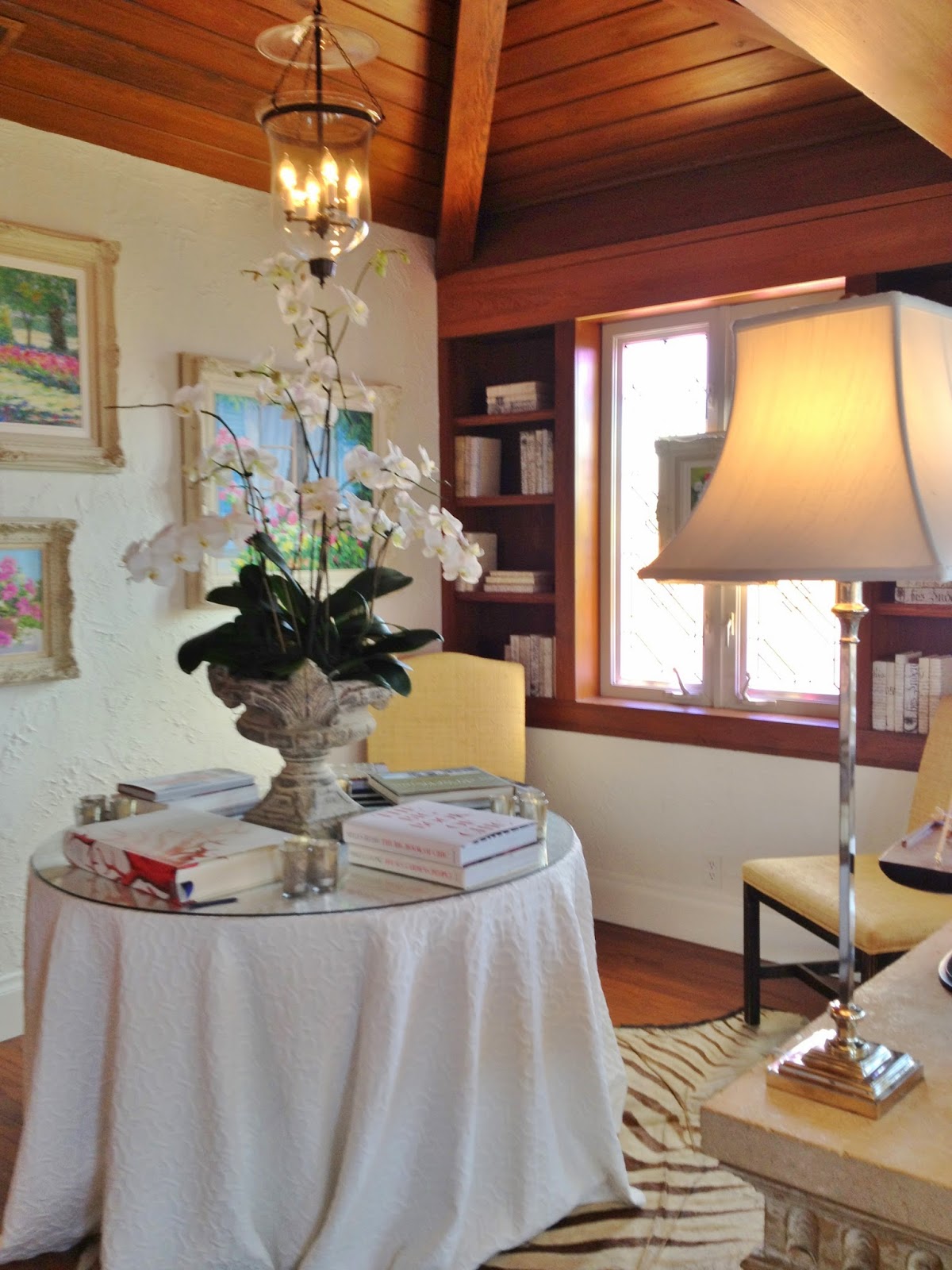
A library in the corner of a bedroom seems unusal but makes sense when you see the rest of this delightful suite.  Built in bookcases, a paneled raised ceiling and pretty lantern turned this corner into the perfect spot to select a book to read curled up in a comfortable chair at the other end of the room.


What was once likely to have been an upstairs porch is now a lovely retreat lined with windows and filled with sunlight.


This is a wonderful space to relax, read, catch up on handwritten notes or a chapter in your new novel  or even play a game.  It is interesting to see how many ways this large area can be used.   It is very functional as well as pleasing to the eye.  Blue and white is a classic coastal color scheme.


 This is a more traditional style yet it still combines English Chippendale with Moroccan. The palm on a pedestal even feels a little Victorian.


The perfect spot for a little daydreaming.

Across the hall The Old Master Bathroom had been updated with a custom designed royal blue vanity, individual mirrors with "picture lights" , semi recessed rectangular sinks and a spectacular counter top.


 If it looks like the counter top is glowing, it is!  This translucent material is lit from below creating a dramatic effect.


It's surprising even with the lighted counter tops, modern sinks and contemporary faucets this bathroom still feels timeless.

A daybed in this Second Guest Room with metalic pillows and a chrome chair are contemporary. Topping a cocktail table with a cushion provides a dual purpose.  Was it originally like this? What do you think?


 Abstract art and silver lamp shade also lend an updated feeling


 Across the room this slender skirted table, 'ruffled" mirror and pair of candle stick lamps feel more like classic Palm Beach....or maybe it is the soft aqua and white colors?  What lies beneath that table? On closer inspection we saw a simple construction in raw wood....but who would know?  Another excellent idea for protecting skirted tables in particular, is to top it with a piece of glass. The button tabs offer a pretty detail, too.


Here is a clever idea.  Replace standard closet doors with panels from a folding screen.  Not only is it a great way to repurpose an old screen but it is so much more attractive!


What was particularly interesting were some of the small spaces that might have gone undecorated.  The designers of this house took full advantage of them.  Below is a small wall between The Old Master Bedroom and The Old Master Bathroom.  The shell console and mirror are stunning and lighting it from below is a simple thing to do but very effective.  You see this wall at the end of the hall.  It's almost like a foyer to The Master Bedroom.  (The chair is for the host/hostess of the room.)


Coincidentally the passageway below is outside The New Master Bedroom.  Though the room beyond is in a traditional style the modern art, artifact and clean lines of the cabinet make this transitional area contemporary.  


The most intriguing little spot was this wall at the foot of that tiny spiral staircase leading to the most fascinating room in the house, The Turret.


The exotic design of this narrow wall was a forecast of what was to be discovered as we climbed that staircase, one step at a time.  (Signs posted warned us to beware.)


This is the way we entered The Turret, one twisted step at a time, but the risk was well rewarded.


Above our heads was a beautiful tented ceiling in navy fabric with little gold stars.  The celestial aura continued with the wonderful starburst light fixture hung from a golden sunburst.


There were globes suspended in front of the windows like the planets. 


 A faux animal skin covered bench introduced a splendid spot to sip a sweet concoction.


Arched windows surrounded The Turret inpiring the designer to create Art Deco type columns in between.  Another bench perhaps to purch while conjuring up travel plans or gazing at the stars. This was by far the most creative room, proving imagination is not limited by the size of a space.

To celebrate the title of The Birthday Cake Castle one of the owners replaced one of the original stained glass windows with this one!


Though this tour is over the inspirations will continue.  Unexpected touches like a painted floor, treating a little space in a big way, using lighting in a different way, replacing old closet doors with carved panels from a screen or French door, mixing modern art, lamps, accessories or furniture with antiques breathes fresh air into an interior design.  Interiors with a twist are more interesting, fun and offer a way to express your own personality and style.

( To find out more about the Show House and for a list of the participating Interior Designers please visit http://www.redcross.org/news/event/2015-Designers-Show-House or www.facebook.com/pages/Red-Cross-Designers-Show-House/462723790442349 )

How do you like to express yourself in your decorating?  In what way would you bring in the unexpected?  As always I invite you to share your experiences and ideas in the comment box below.  I look forward to hearing from you.

Happy Decorating!

If you would like assistance with a interior decorating project please email me at pictureprettyint@aol.com