Showing posts with label Colorful Ideas. Show all posts

Saturday, May 24, 2014

What's new in kitchen appliances....or should I say what's old is new !

As an Interior Designer I can find myself at any given time in all kinds of places.  Just last week a project I am working on with my business partner, Ellie Caimano, took us to a plumbing showroom, a custom mattress shop and a local appliance retailer.  What we discovered there was unexpected and delightful.

These red vintage style appliances are showstoppers.  The black and white tile just adds to the "retroness"

This stove appears pretty authentic, but look closely and see what current feature it has.
How fabulous would these look in a modern day "retro" kitchen?  The refrigerator is the same inside as most current standard refrigerators but when they put the fancy red vintage door on it the price went up to $5,000!  We are actually working on renovating a condo built in the 40"s and this would be perfect. But we are making it look contemporary.....all white...very sleek...so I guess I will have to wait for another day to bring these beauties home.

Does anyone remember cooking on a stove like this....or maybe there was one in your mother's or grandmother's kitchen?  This oldie was on display in the store, but not for sale.  Don't you love the advertisement?

Look at that double oven!  What a  nice work space by the burners too.


Not only does this beauty have a "Sensational new quick-set automatic timer", but it also has a spectacular built in "Jiffy Griddle".  I think it is behind "door #2" on the right.  When you open the door the 2 burner griddle slides out.  
We did spot something new there.  It's a new finish called slate.  It's very cool.  What do you think?  I don't know what goes into creating a new color/finish for appliances.  It could be a very risky investment for manufacturers but it is so nice to see something different!


In the yellow shaded lighting the finish takes on a bronze tone, which is something to remember when selecting the lighting for your own home.  Slate is softer and less obvious than black while still adding a rich tone to go with darker cabinets.
I don't remember the avocado being this bright and cheerful, but I do remember wearing bell bottoms !
Remember Harvest Gold, Avocado Green and Copper?  I remember having to base decorating schemes around the color of the appliances.  I am not kidding!

I think the second photo may be my own kitchen from the 70's!  And look they even made avocado green sinks to match the appliances too! The light fixture in the top photo is back in style.  Maybe there is truth in if you hang on to it, it comes back?

We have probably all seen what they call "integrated" appliances in kitchens.  That is where the appliance has a panel on the front that matches the kitchen cabinets.  The appliances blend in so well that sometimes you don't even realize what you are looking at!

This built-in could almost pass as a pantry with drawers below.

I saw this at another showroom.  It  is a combination of  a freezer, wine cooler and refrigerator.
Can you guess where the freezer is?

This would be great for a wine conoseur but if not, you can have a refrigerator on both sides.  Yes, the freezer is on the bottom.
As we left the first appliance store we spotted this cutie.  Do you know what it is?  Did you know someone who had one?  I think I saw one once on someone's back porch years ago.  Gosh, how far we have come.  This bit of nostalgia was such a treat.  Hope you enjoyed seeing what's new, what's old is new and a few throw backs to a bye gone time.

Yes, I think this old faithful deserves it's blue ribbon!
What do you think about decorating in a "retro" style?  What touches of nostalgia would you like to use in your decorating?  Even in contemporary design a nod to the past can give depth to your decorating, don't you think?

What ideas do you have for a new feature or color in kitchen appliances?  How does the color of your appliances effect the way you decorate or design your kitchen?

As always I invite you to share your experiences and inspirations, or questions, in the comment box below.
I look forward to hearing from you.

                     Happy Decorating!

If you would like assistance with a decorating project please email me at pictureprettyint@aol.com

Friday, January 3, 2014

Decorating with Radiant Orchid, Pantone's Color of the Year

PANTONE COLOR OF THE YEAR 2014 - Radiant Orchid 18-3224


                  Introducing Radiant Orchid, 

                 Pantone's Color of the Year!

Since 2000 The Pantone Color Institute has been selecting their Color of the Year.  So exactly what does that mean?  They seek out the color that they feel expresses in color what is taking place globally.  They choose a color they feel will resonate around the world, not just in fashion but one that crosses all areas of design.  It is an expression of the mood or attitude of consumers. It will influence product developement and purchasing decisions in home, fashion and industrial design.

The PCI team combs the world looking for future color influences, one that is building importance in the world of entertainment, film, art, travel destinations, lifestyles and even sporting events.  And so with the new year comes their choice for 2014, Radiant Orchid.

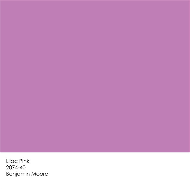
You can find a similar color in Benjamin Moore's Lilac Pink 2070-40


Pantone Unveils Radiant Orchid as Color of the Year for 2014

They describe it as enchanting, a color that encourages creativity and originality.  The rosy undertones emanate joy, love and health.  I think there are many interpretations of the color orchid, some more purple or violet.  Others more pink and softer.

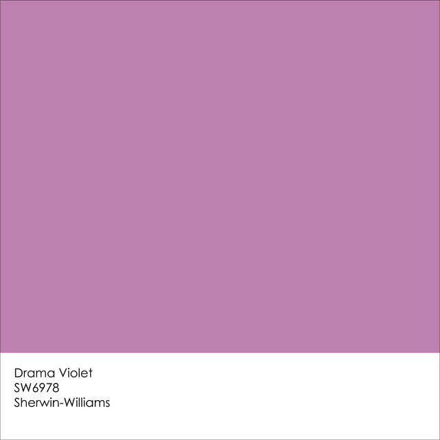
Sherwin Williams comes very close with Drama Violet SW6978.


Pantone Unveils Radiant Orchid as Color of the Year for 2014
How do we incorporate this exciting hue into interior design?  How do you feel about Radiant Orchid?  Is it a color you would like to paint a room?

What a dramatic color statement!
     Maybe such a strong color is easier to use in smaller doses like in the artwork in this living room.


A painting with such powerful color needs to be balanced somehow in another area of the room, like in an area rug and maybe a vase of flowers or an orchid on the cocktail table. That will be easier to do now that orchid is the color of the year. 
 I have to say when I did my first search on line most of the images I found were in fashion, entertainment and  weddings.

Radiant Orchid


Wedding a la Radiant Orchid

I can see how this incredible color will be popular in all these places.  Even looking at some of the images above we can see how orchid can be used with blues, turquoise, lime green and even neutrals like taupe and beige.  These are color pallets we can use in interior design too.

Trend Watch 2014: Radiant Orchid
A softened orchid becomes a backsplash in a contemporary kitchen.

Radiant Orchid chairs
A deeper shade of orchid mixes well with orange and turquoise.

vintage and natural tints of lavender  #pantone #radiantorchid


Radiant Orchid Wedding Ideas

I find myself looking at images of flowers, still lifes, fashion, art or accessories and thinking, that's not just a bouquet, it's a color scheme.  Have you ever taken your inspiration for a color pallet for a room from something totally different?
.

             The colors in the images above translate nicely into the color scheme for this cozy corner.
Tableware #radiantorchid #radiantorchidweddings

Work some bright color into unexpected places
Did a stack of plates inspire this living room seating?
    Here are a few more inspiring images.  There really is no limit to where we can find color shemes
    for our home.
Radiant orchid mixed with jewel tones. #design #interior
Mixing red with orchid seemed to strong for me at first but it is a fun way to add an edgy twist.  The two colors play well off each other especially in a contemporary setting.
PANTONE Color of the Year 2014 - Radiant Orchid decor

#pantone #radiantorchid
Pantone Color of the Year: Radiant Orchid
A colorful wedding cake and fabulous French macarons could inspire a color pallet for an interior, couldn't they?
Gorgeous mirrored vanity table!
Bright Color Palette.
Whether muted or bold these shades of orchid work well when surrounded by neutrals. Below a simple flower may be just the thing to influence the colors for an interior.


Radiant Orchid color ideas | Lonny.com Pantone 2014 color of the year: Radiant Orchid


awesome bathrooms | Purple Bathroom Design Ideas
Would you have the courage to use an orchid sink?  Come to think of it where would you even find a sink this color?  Is the photo of the lantern below just a photo?  Can I even think that any more after writing this post?
Light
This is just one way the image above can inspire a bedroom like this one.
THE BEAUTY COLLECTOR
Even accessories like these beautiful glass vases could be the jumping off point.
Radiant Orchid and Tangerine
Love that chair and brave color combo
Maybe a vivid rug is where you might pull your colors from.
Dash & Albert tribal-inspired diamond design flatweave rug in a bold pink, purple and red colorway via Layla Grayce <3
It all has to begin somewhere.  Sometimes it can be from your own closet, art or fabric. 
"radiant orchid" by sanchez-gaby on Polyvore
 But really your inspiration just comes from opening your eyes and seeing what pleases you.  Then you figure out how you want to use your favorite colors in your decorating.  Do you want it on the larger surfaces like your walls?
Purple Haze Perini Wallpaper
Maybe you like it on your walls but not in such a grand statement.
Paisley Stencils | Bombay Paisley Motif Stencil | Royal Design Studio
Sometimes when I am dreaming up a color scheme and then start looking for fabrics or accessories etc to bring it to life, it is hard to find certain colors.  When the color you want to incoporate into your design happens to be the Pantene Color of the Year,  your treasure hunt becomes a whole lot easier!

Radiant Orchid Apothecary Table Lamp
To buy: Baby Anime Transparent Purple Kids Armchairs, $236.91 for a set of two at 55 Downing Street http://www.ivillage.com/work-pantones-2014-color-year-your-home-decor/7-a-555093?cid=tw|12-11-13

Radiant Orchid vases. So pretty.       

Radiant Orchid embroidered pillowcases!
RADIANT ORCHID

I hope after reading this post you may find that adding Pantene's Color of the Year, Radiant Orchid to your home is not as daunting as it might have sounded at first.  For me this has been an eye opener.  I can't wait to introduce this incredible color to my decorating pallet.  What do you think? 

As always I invite you to share your ideas and experiences in the comment box below.  I would enjoy hearing how you feel about Radiant Orchid.  Is it your color of the year?  

Happy Decorating!

(Portions of this post are taken from Pantone's website and images are courtesy of Pinterest. The Benjamin Moore and Sherwin Williams color swatches are courtesy of a Houzz post by Jennifer Ott of Jennifer Ott Interior Design)

If you need assistance with an interior design project for your home please contact me at
pictureprettyint@aol.com

Sunday, February 10, 2013

Monochromatic Color Schemes


A monochromatic color scheme is one where everything is the same color or shades and tints of the same color.  You might consider a room done in all one color with one neutral as monochromatic,too.

The tricky thing in this one color design is to keep it from being blah.  Once I had a client whose room was all beige and she said she felt like she lived in a bowl of oatmeal!

Here is a living room from House Beautiful Magazine that is an example of a monochromatic blue scheme.  Blue is a restful color, hence if you wanted to create an exciting vibrant feeling, blue would not work.  Here the color enhances a relaxed and calm space.


You can see there are subtle changes in tones of blue.  For that matter, even if every blue were the exact same they would not match because each texture is different. 

What makes this work is the variations in texture and surfaces, including the reflective glass top cocktail table and light wood tones of the tables, and woodwork.  The pair of lamps, end tables, pillows, plants and chairs demonstrates a formal arrangement but the room is not stiff.  It is quite inviting.

I love the large window with light flooding into the room.  A blue room would feel a bit dreary if the window was facing north and did not get much light.

If I was going to make any change in this room it would be to use a mirror or neutral painting or sketch above the sofa.

What do you think?   What changes, if any, would you make? How would you use a monochromatic scheme in your home or next project?

Designing with color


Color is such and important element of design, but how and where it is used can be challenging.  Sometimes just a dash of color is all that is needed to add your personality to a room.

Look what I came across the other day at the Design NS Leather showroom.  It just jumped out at me and said  "look at me".  It actually made me smile.  It reminds me of a court jester both because of it's bold color and curl of the wings.


The color is fun and the overscale design is dramatic which make this chair  both playful and formal at the same time.  What a statement this pop of color would make in any space.

I can see four of these grouped around a cocktail table or a pair in a tall bay window.  They would look fabulous in the lounge area of a fashion designer's salon, too.  What if they were combined with bold black and white striped wallpaper or a black and white chevron patterened rug.  Wait, I see it in an all white room resting on a fluffy white Flokati  rug, surrounded by colorful artwork and a bouquet of brightly hued flowers.

 Where can you imagine this amazing chair?