Saturday, April 12, 2014

Taking the Upstairs Tour of the 2014 American Red Cross Show House

 As promised I am continuing the tour of this fabulous Red Cross Show House in Palm Beach Florida.  Upstairs each of the bedrooms took on a different character as the designers interpreted the space.
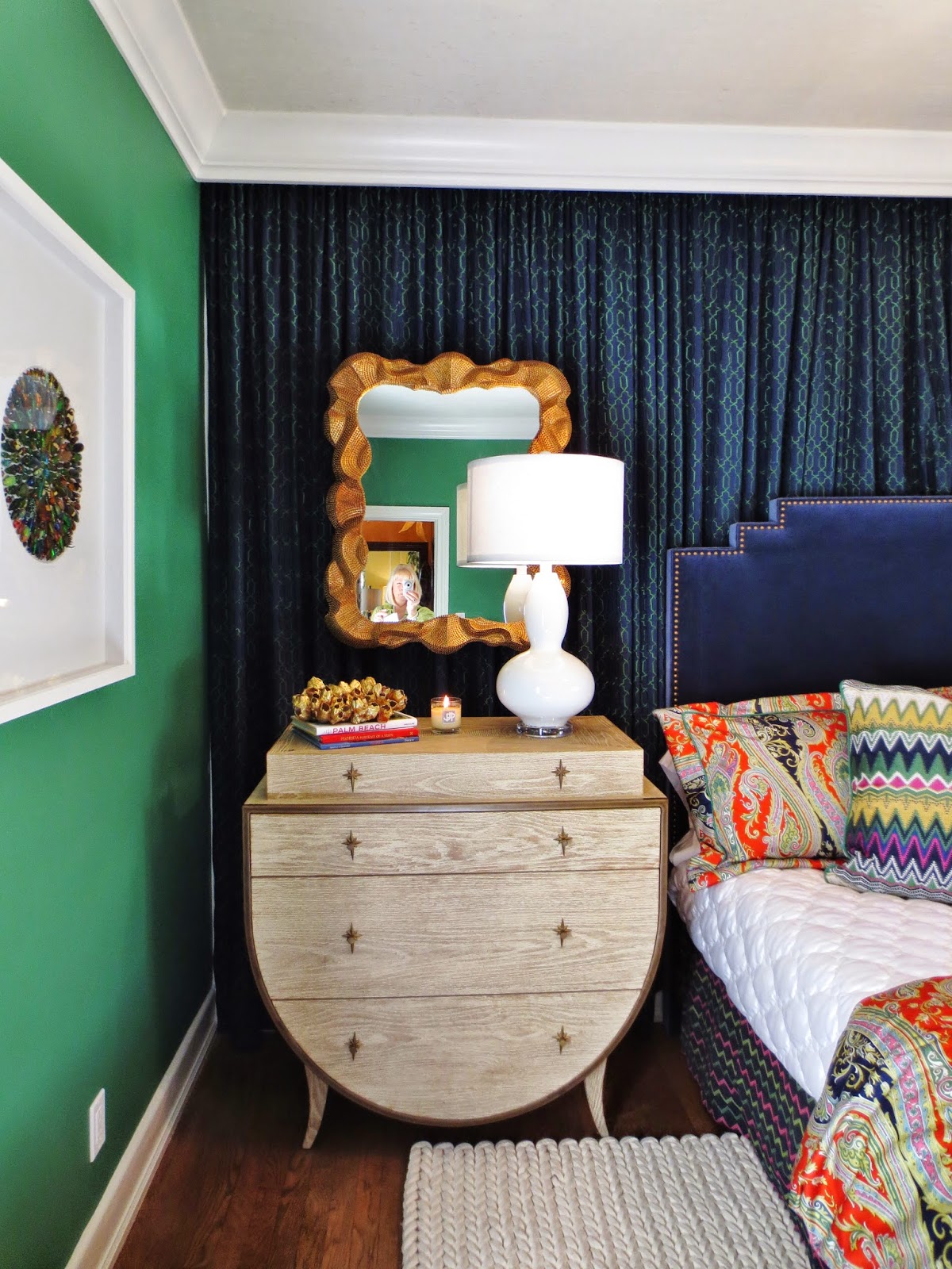
The master bedroom by Melissa Z. Guerra and Noe Guerra of NXG Studio is dramatic with the brightly colored walls and black accents.
There was so much detail to see like the buttons at the top of the drapery panels.
This guest bedroom had lots of personality.
The eclectic blend of styles added to the mix.
These paintings were perfect in this room with such a bold pallet.
The guest room above, by Piper Gonzalez, was all about color and personality.  Using strong contrasting color may not be for everyone but it can be very effective.

Scott Robertson created this guest retreat/sitting room with a more traditional style and color scheme. The striped walls are actually hand painted.
Over sized nail heads gave the daybed a nice accent.

Designer Frank Maguire was not afraid to use color and pattern in this guest bath.
Using a strong pattern like the flame stitch, especially in a large scale, with bright colors in a small space is daring but works well in this bathroom. It might be overpowering for some.  What do you think?

The master bath was traditional and elegant.
The classic use of white cabinetry with black counter tops makes this master bath more dramatic. Introducing a floral wallpaper softens the feeling.

The powder room designed by Melody Smith.
There was even a play house for the children. How charming is that?


This is the outdoor lounge for the "grown ups".  (Both these fun spaces were created by William Bainbridge Steele.)
Perhaps one of my favorite spaces is the outdoor living room.  It was great mix of different styles and pale neutrals punched up by pops of color.  It has such an air of romance.  Outdoor rooms are wonderful spaces.
How would you create your outdoor space?

That about wraps up our tour.  It is fun to look back at all the beautiful images.  There was inspiration everywhere.  So much goes into creating a showcase house.  I really appreciate all the hard work and talent of all the designers.  I enjoyed sharing it all with you.

Which room did you like the most?  What ideas would you like to incorporated into your own home?
As always I invite you to share your thoughts in the comment box.  I look forward to hearing from you.

Happy Decorating ! 

If you would like assistance with a decorating project please email me at pictureprettyint@aol.com  

Tuesday, April 8, 2014

Decorating Inspirations from the 2014 American Red Cross Designer Show House

In previous posts our tour of the American Red Cross Show House described inspiration and design tips from the dining room and living room but there was a lot more to discover.

The study was a light filled room that could not be more welcoming.

This beautiful arched window was the perfect focal point.

Orchids hanging in the window flourished.
The design was filled with layers and details like the contrasting welt on the sofa.
The wainscot molding was placed higher than you might think in this room with average height ceilings.
Placing a comfy chair and ottoman near a window is the best spot to curl up with a good book (or decorating magazine).
The designer, Stephan Mooney, took his inspiration from this fabulous fabric.
Even though it was a large room it had many intimate spaces.  Notice how a small painting hangs on the paneling.  
Another way to add detail is to trim the skirt of a sofa or chair.
A mix of many patterned pillows keeps the study from looking "decorated".
A favorite feature of this house were the little doorways that beckoned.  Look at the arched transom above the door. This hallway lead to a bathroom and a den beyond.

The den, formerly a sun room, was a departure from the adjacent study.  It had lots of personality. The striped carpet was a wonderful surprise and the mid century game chairs were delightful as was the whole room.


The arched windows of the study were echoed on the screened loggia.


A screened porch becomes a delightful living space when comfortable furniture, airy sheers, an area rug and pretty lighting are introduced.


Looking up I spotted handpainted pecky cypress ceilings that were original to the house.


These ceilings added so much to the charm and character of this 1920's home.


Around the corner was the best surprise, a suspended sleeping swing.
There were so many places to get inspiration from in this amazing house.  I loved the "undecorated" feeling of the study, the eclectic mix of mid century and modern in the den and the relaxed casual elegance of the loggia.

Where did you find inspiration?  What did you love best about these rooms?  Would you like to see bedrooms the upstairs?  Stay tuned......

As always I invite you to share your experiences and inspirations in the space provided for comments.
Your comment will appear shortly.   I look forward to hearing from you!     

Happy Decorating!

If you are considering a design project that you might like help with please email me at pictureprettyint@aol.com 

Monday, March 24, 2014

How The 2014 American Red Cross Show House can inspire decorating your own home.

I recently wrote about this amazing American Red Cross Designer Show House but I focused on the spectacular dining room.  Now it is time to continue the tour.  There was so much to see and so much to remember.  Breaking it down to room by room is a great way to focus on just what the designer did and how that might inspire your own decorating.

The elegant living room was designed by Jennifer Garrigues and Diane El-Daher.
The "bones" of this room included a dramatic two story ceiling,  tromp l'oeil wall treatment done for the show house 20 years ago,  original stone floors and a magnificent fireplace. Oh and did I mention French doors? Starting with such phenomenal features is a plus but the trick is to complement and enhance those features and it was done beautifully.

One of the first things I noticed was the pair of over scaled lamps behind the sofa and the way the table runner was draped at an angle across the table.

 Another surprise was the raspberry tiger pillows.
I believe when you add something unexpected a room comes alive.  The lamps got my attention right away but did not overwhelm the smaller proportioned sofa. Because the ceiling and fireplace were so high the room demanded some tall elements.  Perhaps the boldness of the pillows helped to balance the lamps as well.

Jennifer and Diana anchored the room with an armoire at the far end.
Balance is a key element in interior design.  I love seeing how other designers work with those elements.
Not only is the armoire tall but it is RASPBERRY!  If it were a light wood or a pale color would  it balance the room as well? Probably not.

 So here is a "trick of the trade" so to speak.  When you want a cabinet to stand out paint the inside and open the doors!  It reminds me of how a peacock fans it's tail to show off.  A large armoire becomes even bigger. With doors wide open there is opportunity to display treasures and even add a small lamp for additional charm.

Citron colored fabric on a pair of chairs pull that color right from the rug.
In case you wondered where the color scheme for the room came from, just look at the rug.  Shades and tints of those colors are a great way to tie it all together but without matching.

 Smaller scale armless chairs help keep the space from being over crowded.
Because the ceilings are so tall, the room seems to be large but in truth the floor space is long and narrow.  It is tricky to design. In addition to the high ceiling there was a double staircase leading to each of the upstairs wings.  As you looked down you got a birds eye view of the living room.

A large cocktail table holds what looks like family treasures brought back from their travels.
A cocktail table can be a challenge to accessorize.  Once again height in this room is important, so the designers used a group of tall tapers but they are supported by a beautiful tray.  For mid-height and color they added  fresh flowers and elevated a candle on a stack of books.  A small red box sits next to the flowers as the lower level object d'art.   It is usually most effective to arrange accessories in odd numbers and in varying heights.

The desk behind the sofa is full of accessories.  
For some this may be a bit busy.  Perhaps if the table cloth were not so colorful it would look less cluttered. Though it is gorgeous, I find it hard to appreciate.....So, as in film making, editing is also an important part of design.  Working with different clients I find everyone's tastes vary.  Some like it almost Zen-like and others go all out.  I think often you can tell a lot from the way a home is accessorized.  In this case I would guess that this "family" had acquired many items from traveling the world and loved to see them displayed in their home.

One design tip is to accessorize like everything was acquired over a long period of time rather than all being purchased at local showrooms when you are finishing your project.  Of course this room was designed over a short time period but it definitely has an "acquired" feel.  Shopping at local consignment, thrift or antiques shoppes is a good way to accomplish that look.

There was so much to take in and so many things the designers did to create this impressive space.  The elements of height, balance, color and scale all played so well together.  What "take away" will you use in creating a room in your own home?  What did you like best about this living room?  While the room itself may not be your style, how would you translate some of what you see to into your own interior?

As always I invite you to share your experiences and inspirations in the comment section of this post.  There was so much to appreciate in this showcase house.  Stay tuned and....

                                Happy Decorating!

If you would like assistance with a decorating project please email me at pictureprettyint@aol.com

Saturday, March 15, 2014

Red Cross Designer Show House dazzles and inspires!


Last week I had the privilege of volunteering, along with fellow IFDA members, as a hostess for an American Red Cross Designer Show House.  There was so much to see.  There were 15 designers participating.  All the rooms were amazing.  There were some I could have moved into myself.

Ville delle Palme was built in 1925 and has been updated over the years. It was a showcase house 20 years ago!
There was so much to see and experience. It is sometimes overwhelming to try to take in all the details.  As a hostess I chose the dining room as my first location.  Spending time in one room really allowed me to take in everything slowly and appreciate designer Katherine Shenaman's talents even more.  Katherine has done outstanding projects in Palm Beach, Miami and New York, to mention a few.

The beautiful yellow scenic wallpaper and elegance of this room caught my eye right away.
 I thought the walls might have been hand painted but they are wallpapered in panels of a scene that goes around the room.  Wallpaper like this can often be custom colored as well. It has a dramatic effect and sets the tone for the whole room.

I would be happy to sit a while in this pretty corner of the room (and I did).

At first glance the room felt very traditional. Certainly the walls, chandelier, sconces and the draperies were traditional but as I looked closer I saw the dining table was lucite, the chairs were mid-century or maybe from the 70's or 80's and the side board was simply a work of art.

A contemporary silk rug anchors the center of the room. The chairs are updated with more current stylized leopard fabric with a metallic background.


Ordinarily I would have thought this credenza would be too busy against the patterned walls but it looked fabulous.
Look closely and you can see the design is painted on mirror!
(In a future post you will see that painting on mirror is done in a major way in this vintage home.)

Perched on top were these charming contemporary Jonathan Adler birds.
While silver toned finishes have been so popular these last few years, it is interesting to see gold popping up and being used together with silver.  It looks gorgeous in this elegant space

I might have missed the all important details  if I had just walked in, looked around, and moved  on to the next room.  Here are a few that I noticed.

The vents were hand painted to blend with the wallpaper.

Not painting vents to match or blend with walls and ceilings happens to be a pet peeve of mine.  It is very distracting to have a white or aluminum vent right in the middle of a painted...or papered wall or ceiling.

Look how nicely the wallpaper frames the triple arched French door.
In a showcase house you always need to remember to look up!
The moldings in this house were incredible.  


A beautiful view makes this dining room an even more wonderful place to spend time.  
Connecting the outside with the inside can be easy to over look but it is very important and can make all the difference.  Don't forget to look beyond the interior of your home and where possible strive to give your room a pretty view, even if you don't have a fountain in your garden or columned vintage home.


The original hardware added additional character to this charming room.

If you are looking to add the charm of an older home to a new one, introducing antique hardware could make a big difference.

The place settings brought in a touch of lime and a splash of Pantone's color of the year, Radiant Orchid, in a live orchid of course!

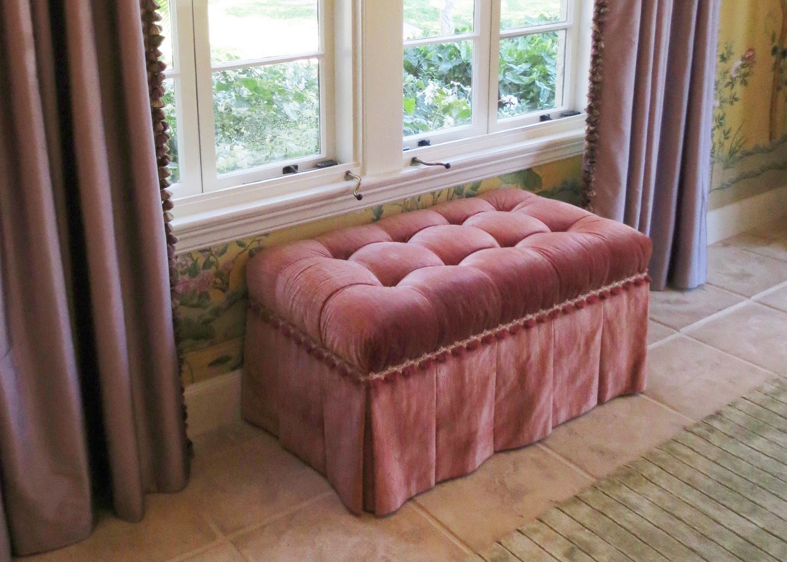
The muted purple silk draperies with lush tassel fringe is a soft compliment to this rose tufted ottoman, also edged with pretty trim. 
 It was great to see that the designer didn't match any colors, yet all the colors were in the wallpaper.  When you find a wallpaper like this it becomes and instant color scheme.  You can have fun playing with them in varying shades and tints.


I hope you enjoyed spending some time in this lovely dining room.  What details did you see that you will use in your next decorating project?  Learning from top designers is a great way to get confidence to make changes in your own home.
Stay tuned for future posts about this incredible show house.  There is much to see!  Thank you to Katherine Shenaman for creating such a beautifully detailed and gracious space.

Do you like to visit designer showcase homes?  What ideas have you gotten from seeing designers'  model homes? As always I invite you to share your experiences and ideas in the comment box.  Your comment will appear after it has been forwarded to me.

                Happy Decorating!

If you would like assistance with a decorating project please contact me at pictureprettyint@aol.com