Friday, January 3, 2014

Decorating with Radiant Orchid, Pantone's Color of the Year

PANTONE COLOR OF THE YEAR 2014 - Radiant Orchid 18-3224


                  Introducing Radiant Orchid, 

                 Pantone's Color of the Year!

Since 2000 The Pantone Color Institute has been selecting their Color of the Year.  So exactly what does that mean?  They seek out the color that they feel expresses in color what is taking place globally.  They choose a color they feel will resonate around the world, not just in fashion but one that crosses all areas of design.  It is an expression of the mood or attitude of consumers. It will influence product developement and purchasing decisions in home, fashion and industrial design.

The PCI team combs the world looking for future color influences, one that is building importance in the world of entertainment, film, art, travel destinations, lifestyles and even sporting events.  And so with the new year comes their choice for 2014, Radiant Orchid.

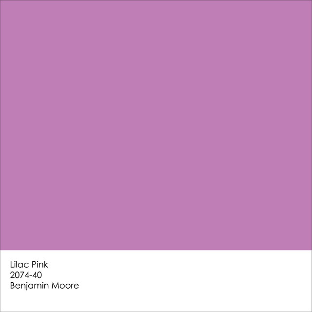
You can find a similar color in Benjamin Moore's Lilac Pink 2070-40

Pantone Unveils Radiant Orchid as Color of the Year for 2014

They describe it as enchanting, a color that encourages creativity and originality.  The rosy undertones emanate joy, love and health.  I think there are many interpretations of the color orchid, some more purple or violet.  Others more pink and softer.

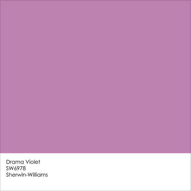
Sherwin Williams comes very close with Drama Violet SW6978.

Pantone Unveils Radiant Orchid as Color of the Year for 2014
How do we incorporate this exciting hue into interior design?  How do you feel about Radiant Orchid?  Is it a color you would like to paint a room?

What a dramatic color statement!
     Maybe such a strong color is easier to use in smaller doses like in the artwork in this living room.


A painting with such powerful color needs to be balanced somehow in another area of the room, like in an area rug and maybe a vase of flowers or an orchid on the cocktail table. That will be easier to do now that orchid is the color of the year. 
 I have to say when I did my first search on line most of the images I found were in fashion, entertainment and  weddings.

Radiant Orchid


Wedding a la Radiant Orchid

I can see how this incredible color will be popular in all these places.  Even looking at some of the images above we can see how orchid can be used with blues, turquoise, lime green and even neutrals like taupe and beige.  These are color pallets we can use in interior design too.

Trend Watch 2014: Radiant Orchid
A softened orchid becomes a backsplash in a contemporary kitchen.

Radiant Orchid chairs
A deeper shade of orchid mixes well with orange and turquoise.

vintage and natural tints of lavender  #pantone #radiantorchid


Radiant Orchid Wedding Ideas

I find myself looking at images of flowers, still lifes, fashion, art or accessories and thinking, that's not just a bouquet, it's a color scheme.  Have you ever taken your inspiration for a color pallet for a room from something totally different?
.

             The colors in the images above translate nicely into the color scheme for this cozy corner.
Tableware #radiantorchid #radiantorchidweddings

Work some bright color into unexpected places
Did a stack of plates inspire this living room seating?
    Here are a few more inspiring images.  There really is no limit to where we can find color shemes
    for our home.
Radiant orchid mixed with jewel tones. #design #interior
Mixing red with orchid seemed to strong for me at first but it is a fun way to add an edgy twist.  The two colors play well off each other especially in a contemporary setting.
PANTONE Color of the Year 2014 - Radiant Orchid decor

#pantone #radiantorchid
Pantone Color of the Year: Radiant Orchid
A colorful wedding cake and fabulous French macarons could inspire a color pallet for an interior, couldn't they?
Gorgeous mirrored vanity table!
Bright Color Palette.
Whether muted or bold these shades of orchid work well when surrounded by neutrals. Below a simple flower may be just the thing to influence the colors for an interior.


Radiant Orchid color ideas | Lonny.com Pantone 2014 color of the year: Radiant Orchid


awesome bathrooms | Purple Bathroom Design Ideas
Would you have the courage to use an orchid sink?  Come to think of it where would you even find a sink this color?  Is the photo of the lantern below just a photo?  Can I even think that any more after writing this post?
Light
This is just one way the image above can inspire a bedroom like this one.
THE BEAUTY COLLECTOR
Even accessories like these beautiful glass vases could be the jumping off point.
Radiant Orchid and Tangerine
Love that chair and brave color combo
Maybe a vivid rug is where you might pull your colors from.
Dash & Albert tribal-inspired diamond design flatweave rug in a bold pink, purple and red colorway via Layla Grayce <3
It all has to begin somewhere.  Sometimes it can be from your own closet, art or fabric. 
"radiant orchid" by sanchez-gaby on Polyvore
 But really your inspiration just comes from opening your eyes and seeing what pleases you.  Then you figure out how you want to use your favorite colors in your decorating.  Do you want it on the larger surfaces like your walls?
Purple Haze Perini Wallpaper
Maybe you like it on your walls but not in such a grand statement.
Paisley Stencils | Bombay Paisley Motif Stencil | Royal Design Studio
Sometimes when I am dreaming up a color scheme and then start looking for fabrics or accessories etc to bring it to life, it is hard to find certain colors.  When the color you want to incoporate into your design happens to be the Pantene Color of the Year,  your treasure hunt becomes a whole lot easier!

Radiant Orchid Apothecary Table Lamp
To buy: Baby Anime Transparent Purple Kids Armchairs, $236.91 for a set of two at 55 Downing Street http://www.ivillage.com/work-pantones-2014-color-year-your-home-decor/7-a-555093?cid=tw|12-11-13

Radiant Orchid vases. So pretty.       

Radiant Orchid embroidered pillowcases!
RADIANT ORCHID

I hope after reading this post you may find that adding Pantene's Color of the Year, Radiant Orchid to your home is not as daunting as it might have sounded at first.  For me this has been an eye opener.  I can't wait to introduce this incredible color to my decorating pallet.  What do you think? 

As always I invite you to share your ideas and experiences in the comment box below.  I would enjoy hearing how you feel about Radiant Orchid.  Is it your color of the year?  

Happy Decorating!

(Portions of this post are taken from Pantone's website and images are courtesy of Pinterest. The Benjamin Moore and Sherwin Williams color swatches are courtesy of a Houzz post by Jennifer Ott of Jennifer Ott Interior Design)

If you need assistance with an interior design project for your home please contact me at
pictureprettyint@aol.com

Friday, December 27, 2013

Getting to know the incredible Lillian August


One of our local trade showrooms, Designer's Resource Center,  hosted an evening with Lillian August.  If you don't know this amazing woman I invite you to go to her website and become familiar not just Lillian but her design firm, her furniture lines and more.


Lilian August in her design studio.

I discovered that like Kathryn Ireland, Lillian came from a background in textiles and sewing.  She was originally a quiltmaker.  At one market the people from Imperial Wallcoverings approached her to design a wallpaper in a quilt pattern. It turned out to be their best seller!  She has come a long long way since then.


In this image from her website you see her classic style furniture
but with an updated edge.
The room setting above is very neutral, but neutral does not mean boring, especially when you  see how Lillian August works with it. She takes a simple pallet and brings in a variation of textures, subtle pattern, a touch of history, a bit of nature and pretty accessories. This space is elegant without being formal.  Hers is a layered look. She calls this telling a story.

Here's an image from her company's portfolio of the Clapboard Hill Home.
How is this for telling a story?  What an interesting collection of furniture and accessories. It makes me feel like I would like to get to know more about the people who live here. It seems to truly express their personalities. What starts out as neutral becomes exciting with the splash of paprika on the sofa and the accessories in the bookcases.  Look how the time worn texture of the cocktail table takes the edge off the white upholstery.

 Lillian is challenged with coming up with something new in her furniture, fabric and accessory lines each season. She told us we must learn to differentiate ourselves.  She cautions designers, we are only as good as our research.  Lillian often likes to start with color trends and stories. Color in design is influenced by fashion so Lillian keeps an eye on fashion trends as she begins to cultivate her color story. Travel is also an inspiration.  Even finishes and metals can change from season to season. Now gold is edging out silver, chrome and polished steel.

It is important to keep things fresh. Perhaps it is a new finish or new detail added to something that was part of her line before.  Maybe she takes something and tweaks it like putting a chest on a stand or using a natural Belgian linen on her upholstery. She even combines the linen with leather.  Here is  her Ally dining chair in two different looks.  It is her top selling dining chair.


This is the Nicole chair. I believe it is the one she calls her "pet"
because you can use it anywhere and in so many fabrics.


Lillian says chairs give the room personality!


You can see from just these two sofas her line varies tremendously.  Here a traditional black and white sofa gets a makeover with careful attention to the use of fabrics and detail.  The orange sofa takes traditional tufting to a new level.  What a dramatic statement it makes!

Interestingly Lillian manufactures her furniture both overseas and in the United States.  Products made overseas are only available as you see them while manufacturing in the US allows customization and flexiblity.

For many years I identified the Lillian August style with traditional and even Country French design but over the last few years her style has evolved and keeps pace with our ever changing world.  I do think she "keeps it fresh" as she says.  Even her more traditional collection is updated and even edgy depending on the use of fabrics and finishes.


The cerused oak finish on this cocktail table is accented with an additional metal detail.


A wing chair gets a streamlined makeover.

Lillian August gives us so many looks to choose from.  She describes them as follows, 1920's Glamour,
London Townhouse, International Lux Style, True Blue Hallmark, American Glamous, The Power of Plum, The Well-Traveled Man, Urban Neutrals and Black and White with a Twist.  You can see all her latest introductions on her website, www.lillianaugust.com 

Lillian joined in our group photo seated in her favorite "pet" chair.
My designer friends Lucille of Gianna Designs and Vicki of Infinity Designs and myself were so delighted to get to know this design icon as she presented her current line to us at Designer's Resource Center.  It is always an advantage to be able to see and sit in the furniture lines we recommend to our clients.  Her furniture is even more impressive in person.

Are you familiar with Lillian August?  Have you ever purchased her furniture?  What do you think of a layered style of decorating?  One layer often over looked  is fragrance.  How adding that finishing touch should be the subject for another post don't you think? How does your interior tell your story?

As always I invite you to share your ideas and experiences in the comment box below.  I would enjoy hearing from you .

                                Happy Decorating!

If you would like assistance with an interior design project, please contact me directly at
pictureprettyint@aol.com


Saturday, December 14, 2013

Meeting Thom Filicia at DCOTA Fall Market


Guess who I met  at the Fall Market at The Design Center of the Americas in Dania Beach, Florida?  He was the Interior Designer on Queer Eye for the Straight Guy, apprenticed at the legendary design firm Parish-Hadley, and graduated from Syracuse University. Now has his own line of fabrics and furniture and has authored a new book called "American Beauty, Renovating and Decorating a Beloved Retreat."  Yes, Thom Filicia, himself took part in the keynote panel discussion and signed books (and took photos) at a reception afterward at the Kravet.

The keynote panel with Thom Filicia and Campion Platt 
(sorry for the fuzzy photo)
One of the topics the panel discussed was how the internet is changing the business of interior design.  With all the various resources on line clients have access to more than ever before.  That said, it is not just about being able to purchase, our job is to create the design and bring it all together.  Being able to go to sites like Houzz.com or Pinterest.com gives clients and designers a great way to start a dialogue. Then the designer takes over and and does what they do best, bring it all to life.

They also talked about the "democratization" of design, meaning with so many resources in all price points, an interior today can be sourced in so many ways that was not available before.  Bringing together a mix of high end and lower end, retail and custom, humble and refined, gives a modern approachable and liveable design.
Thom with my business partner, Ellie and me in the Kravet showroom.

We all purchased his new book.  He was charming and delighted to chat with us.
Ellie told Thom about the new design project in the owner's lounge in her condo that will be done in all his furniture and fabrics.  He was so excited! I can't wait to see how it turns out.  It will be beautiful. He told us he wants to come see it when it is installed!

His book looks fabulous.  I can't wait to read it.

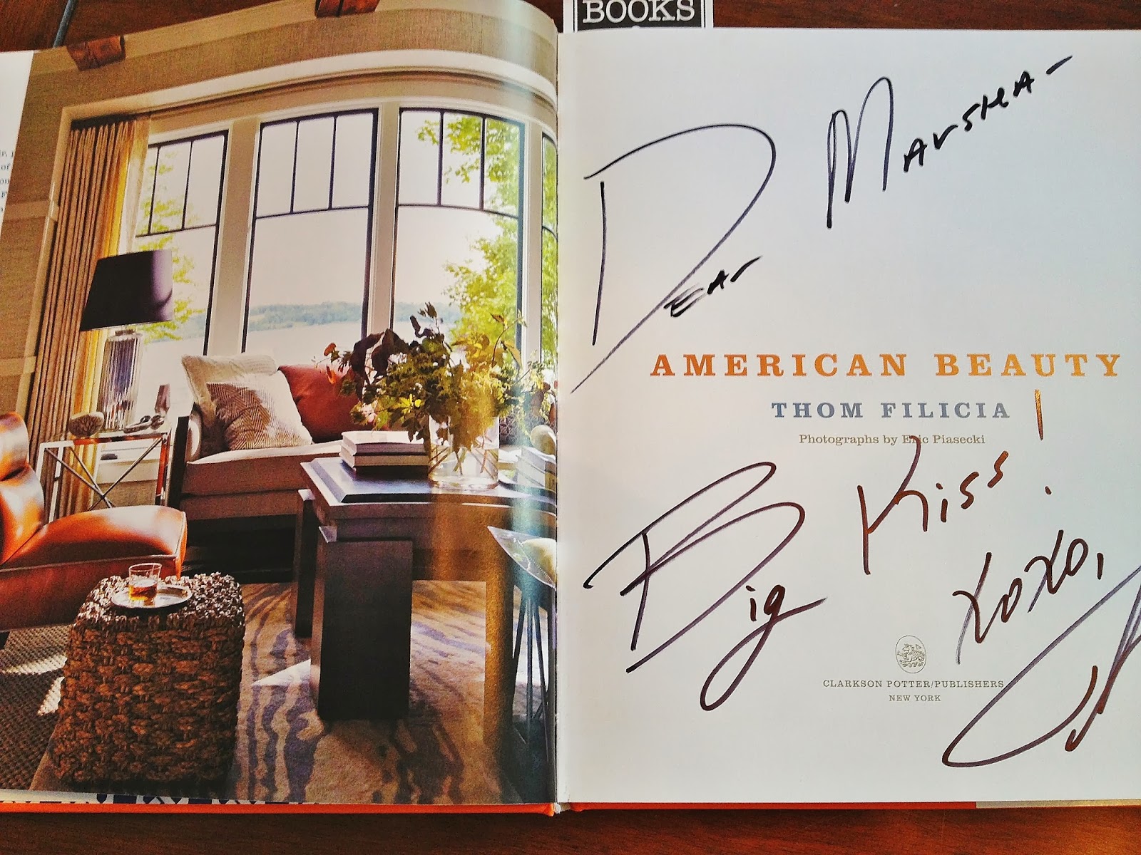
Here is a glimpse inside the cover.  He wrote this fun autograph to me inside, too.

Doesn't he look like he is just so comfortable and about to invite you in for coffee?
The house he wrote about in his book is located near where he spent his childhood.

The Fall Market at DCOTA is an annual event where designers can attend seminars and listen to panels of celebrities discuss current trends in design.  They have terrific speakers, luncheons and receptions all day long.  I always come home exhausted with my mind on design overload.

Isn't this one of the most creative floral arrangements you have seen?
It greeted us at the reception desk when we arrived.

Our first presentation was at the Jeffrey Michaels showroom.  The topic was wallpaper and here 
are two I just loved.

This looks like a ceramic tile mosaic but, no it is actually wallpaper!
They had a the whole wall behind the reception desk papered in it.  What a dramatic statement!

This wallpaper is made out of grass but is certainly "not your grandmother's grasscloth".
Here is a twist on a sunburst mirror...oval.
I love the bold red wall and draperies with black and white striped lining.

Does this look like your typical outdoor fabric?


Next I went to Century Furniture for an update on what is new in outdoor furniture.  I took this photo of a fabric that was passed around.  It was so soft and draped so well I could not believe it was outdoor fabric.
They also showed us a product they called outdoor leather!  The great thing about these outdoor fabrics is that they are just as wonderful inside, too. They are practical for high use and families. So much has been done to improve the "hand" as we call the feeling of the fabrics.  It was inspiring.

As I stolled through the hallways I always like to check out the little display windows. I noticed these unusual fabrics.  They all have a textured pattern, like they have been stitched on to the top of the background fabric. The edges are loose giving the design even more interest.


The pattern on this fabric had a felted look.  So different and interesting.
It had an artisan handcrafted design.

At the Kravet showroom they showed this hounds tooth gray and white sectional with brightly colored orange pillows.
I like the mix of geometric, solid and floral (shown above).  You can see the grays do not match exactly.
Not matching perfectly is one way to make your room look like it was put together over a long period of time.
How do you feel about not matching every color?  Do you like the more relaxed feeling that creates?  When the colors do not match I think an interior looks less decorated...meaning that it was not orchestrated.  The end result is more natural and less forced.  What is your style, to match or not to match, that is the question.

The last keynote presentation was done by the design team of Hellman and Chang.

Hellman Chang are designers and manufacturers of incredible modern furniture such as this cocktail table.
Often done in a darker wood like walnut, this stunning table is in white lacquer.
This dining table is one of their signature designs and is available in console tables and accent tables too.
One of the things Hellman and Chang spoke about was how they love working in wood because wood "tells a story".  It has an organic and a romantic value. Their work is like sculpture!

I managed to squeeze in one more seminar presented by Sherwin Williams on the color red, which happens to be one of my most favorite colors.  I am making a note to write about that in a post all on it's own.

1037
This spectacular Italian chest is one of many shown at the Decorative Crafts showroom.
They also carry incredible lighting, mirrors and more.
I wound down the day at the Decorative Crafts showroom with a glass of champagne and a book signing by  Claudia Strasser.  Claudia offers tours of The Paris Flea Markets!  They are the most fantastic places to find all kinds of antiques and treasures.  Stay tuned for more on Paris Flea Markets too.

the paris apartment book


Paris Flea Market Style
These are two of Claudia's books.  I know I will be wanting to do some
 Flea Marketing in Paris after I read them!
It can be overwhelming even for interiors designers to spend such an incredible day. Days like this always leave me wanting more.  It's a passion, you might say.  What are you passionate about in decorating and design?  What makes your head swim or keeps you up at night?

Whew, this post covered a lot of topics.  As always I invite you to express your ideas and experiences on any of these subjects in the comment box below.  I look forward to hearing from you.

                                     Happy Decorating!

If you are planning a decorating project in your home and would like some assistance you may contact me directly at pictureprettyint@aol.com.