Radiant Orchid was a winner in 2014. Can Pantone's Color of the Year for 2015 be a big hit, too?
How does Pantone select the Color of the Year? According to their website they comb the world looking for what they call color influences, meaning what is going on in the world that is having an impact on our lives. They take inspiration from film, art, travel, socio-economic conditions, technology, upcoming world events and beyond.
When I look at some of Marsala's predecessors I see more vibrant and exciting color choices so it is interesting to me what drew Pantone to this rich more earthy hue.

Pantone describes Marsala as "a naturally robust and earthy wine red that enriches our minds, bodies and souls." It's "impactful fullbodied qualities make for an elegant, grounded statement color when used on it's own or as a strong accent to many colors".
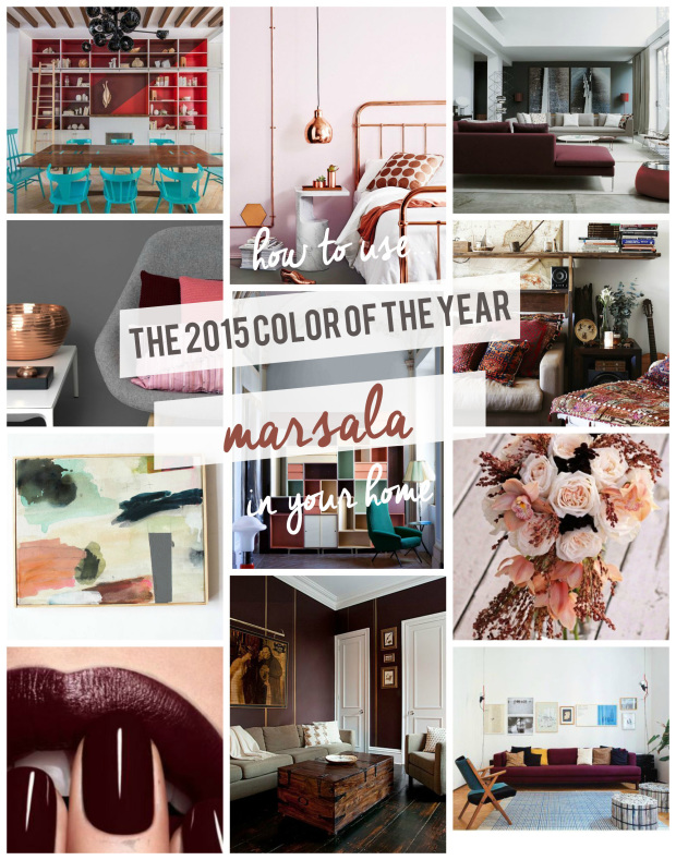 |
| (Photo collage above is courtesy of eastcoastcreativeblog.com.) |
Marsala lends itself to texture such as rugs, upholstery and bedding.
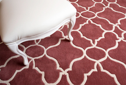 |
| Here you see it in a new carpet by Oriental Weavers as shown in Home Accents Today. |

So as we see Marsala start to emerge in home furnishings, how would you like to see it used?
Would you like it as a main color in your pallet such as on the walls?
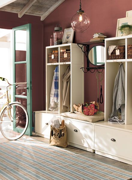 |
| (Photo courtesy of KitchAnn Style) |
Marsala definitely has a brown under tone. See how well it works with an accent of turquoise and balanced with a healthy dose of antique white.
 |
| (Courtesy of Georgiestclair.com) |
 |
Marsala seems to play well with any shade of blue. (Courtesy of houseofturquoise.com) As you can see from the image above from bridalmusings.com there are many colors that compliment Marsala. So now I am interested in finding more ways to see how it works in home furnishings.  This bouquet combines several of the colors shown above. Look at how pretty marsala shows up against blush, olive and gray.  Here we see shades of Marsala in wallpaper Askew-on-Sterling-Sliver-Guilded found on materialgirlsblog.com. But I love it combined with golden ochre, another earthy color. The rustic finish on the cabinet adds an additional layer. That one small dab of green is perfect.   |
 |
| (Photo found on Chrislovesjulia.com) Charcol is a fabulous backdrop Marsala and deep hues of blue pair well with it too. |

 |
| (From the Zoe Report) |
Of course Pantone's Color of the Year is to be found in all facets of our surroundings, especially fashion. When I look at this photo I see a color scheme for interiors similar to the images above.
 |
| (Photo courtesy of Houzz.com) |
What fun it is to see Marsala on this kitchen island. I like the way it is repeated as the back drop for the book case and in the stripe in the draperies. The red colored mixer is not exactly Marsala but it works in this room!
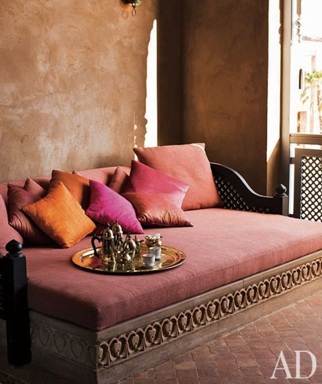 |
| Marsala is a favorite among Bohemian and Moorish inspired interiors. Paired with golds and turquoise this color can be soothing and rich says Ann Porter of KitchAnn Style.com |
It's hard to pin down the true color of Marsala. It's not burgundy, or brick, or even maroon. I would call it wood rose which is a brownish rose. Though not as vibrant as Radiant Orchid, it can see it's appeal. I have scoured images in House Beautiful, Elle Decor, and Veranda. Marsala is not to be found in those photo libraries most likely because fabrics and finishes in Marsala are just now beginning to make their appearances but pretty soon you will see it popping up everywhere.
Here's what HGTV's David Bromstad had to say about Marsala:
"I was a little shocked that the Pantone color of the year was 'Marsala'. When I looked up the previous 'Color of the Year' and saw what their trends were, it made perfect sense! Red has not been a part of the 'Color of the Year' since 2007. This is the color that is going to be seen everywhere. It's universal, it's sexy, and who doesn't love sexy?"
So what do you think of this years pick? Can you warm up to Marsala? Where would you be tempted to use it? The reviews I have read are mixed but after doing my research for this post I am feeling more confident about using it in a color scheme. How about you?
As always I invite you to share your thoughts and inspirations in the comment box. I look forward to hearing from you.
Happy Decorating!
If you would like assistance with a decorating project of your own please contact me at
pictureprettyint@aol.com
Joanne says it reminds her of chocolate and burgundy and she loves it.
ReplyDeleteTim commented, "It is a very interesting color."
Betsy remarked, "Great blog as usual."
Thanks for your comments everyone. I always appreciate knowing your thoughts. So far over 50 people have viewed this post. I am anxious to hear what others think of Marsala, too.
ReplyDeleteIrene wrote to say:
ReplyDeleteI like it a lot, it is very rich and warm – a pleasant change from all the (too) bright colors from the recent past.
Thanks Irene,
DeleteI agree, it is warm and rich. I think I spotted it on some leather chairs at a loca Starbucks of all places. It looked great!