Saturday, April 11, 2015

2015 Palm Beach American Red Cross Designer Show House, Trendy and Classic

How can a house built in 1925 by a protege of renowned architect Addison Mizner, G. Sherman Childs, be trendy?  This year's Palm Beach American Red Cross Designer Show House was a delightful mix of new and old, classic and trendy, and the unexpected..  The 20 Interior Designers who transformed this beautiful 7,000 square foot waterfront home left no detail unattended to.

Palm Beach’s Birthday Cake Castle

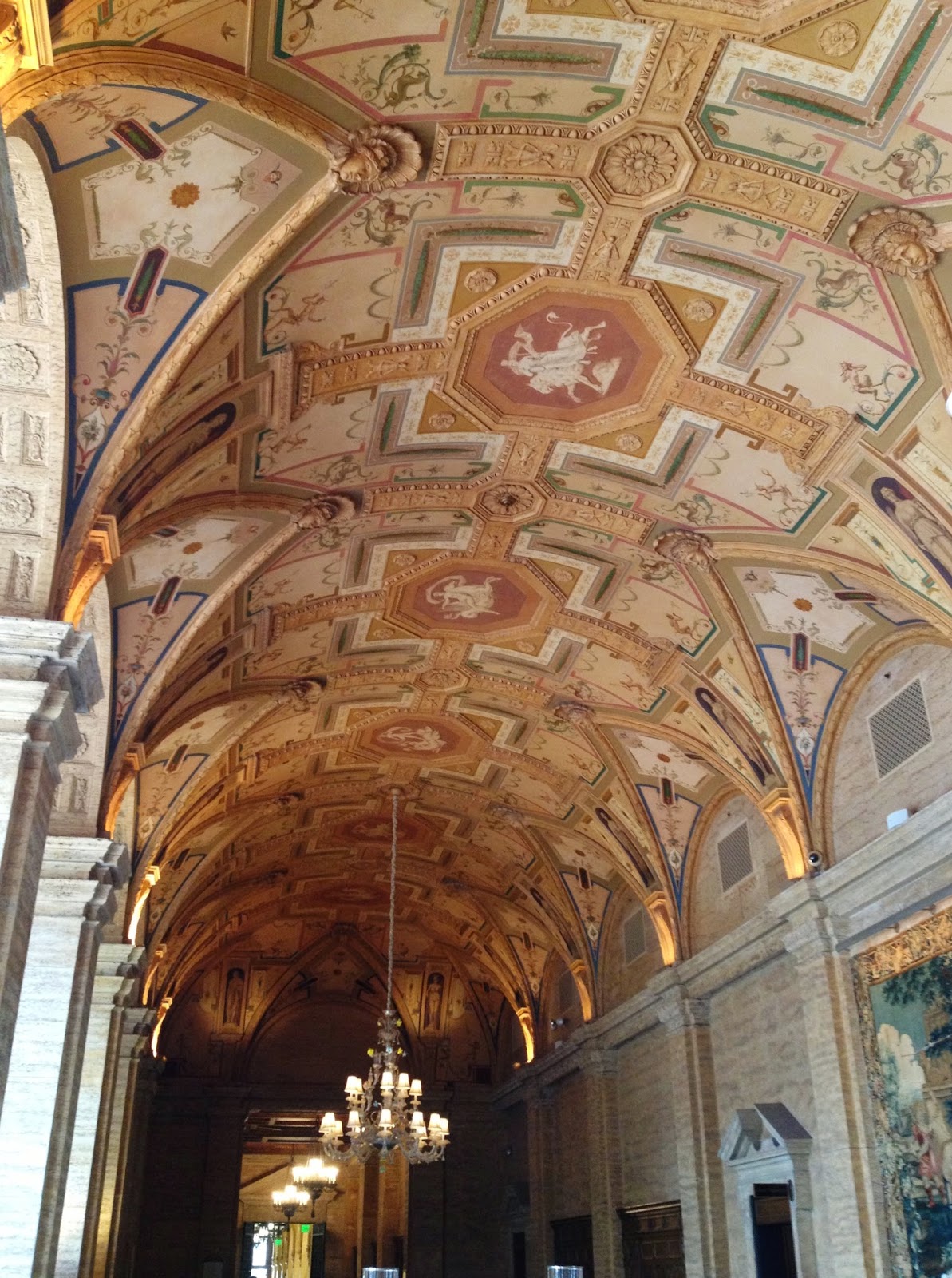
There was so much to see and enjoy. It will take more than one post to explore it all.  So let's begin with The Loggia.


What is more striking the bold turquoise used liberally throughout the room, the sunlight flooding the space or the guilded furniture?


Some would say the blue orchids dyed to match the decor are a little "over the top".  Some would say they are the perfect finishing touch.  What do you say?


From the Loggia we entered the serene elegant Living Room.  It invited us to sit and stay awhile.


The Living Room is spacious with beautiful windows dressed simply with drapery panels and plain iron rods.  The molding on the ceiling is not overly ornate and could be replicated in any home today.  Ceilings, or the fifth wall, are frequently overlooked but they are a perfect place to add unexpected detail.


The sideboard was overscaled but right at home in this room.   The ornate antique gold leaf mirror gave a formal feeling and the pretty round ottoman found the perfect hiding place tucked underneath.


One delightful surprise was the pair of lavender velvet tufted chairs. Lavender has been popping up in design showrooms here and there.  It breaks up the simple soft blue and white scheme so subtley.


The addition of a band of trim on the skirt of the sofa is a lovely detail.  That's something you could do yourself.  Once I hot-glued boullion fringe to the skirt of a sofa just to dress it up for a model home.


Off the formal living room is an area called The Cigar Room.  It is decidedly masculine. The walls are navy blue creating an intimate but dramatic space.


Peering through the French doors we could see the patio and garden with the waterway beyond.


Off The Loggia is another welcoming room, The Study, with it's eclectic mix of traditional and contemporary. Is that lucite cocktail table a mid-century find or new?


Including odd pieces like this bench, which could have been from a trip to the Orient or Africa gives a more collected feeling. The sun shining on it puts it right in the spotlight.


On one side of the sitting area is a comfy traditional tufted club chair and antique table, resting on a more trendy geometric sisal rug.


On the opposite side are a pair of contemporary chairs with chrome arms and a sled base.
If you look back at the first image of this room you might spot a sculpture of 3 tall sticks, an interesting mix of classic and modern.

Continuing on our downstairs tour we entered the spectacular Kitchen.  Why spectacular? First because of the height of the ceiling and exposed beams.  And then there is that walk-in wine room!  This end of the house was remodeled and included an addition, which we understand was only finished the day before the designers moved in!


Using three light fixtures hung at different levels can be more interesting than all in a row or one big fixture.  This unexpected touch also gave reference to the tall ceiling.


At one end of the casual dining area was a large cabinet that offered display as well as a hiding place for a small refigerator.


The simple white cabinetry and marble countertops were classic but an intricate marble mosaic was a stand out on the backsplash.


The Formal Dining Room also blended old and new. Old were the antique oak dining table and well worn leather chairs. New were the chandelier, and the sisal carpet.


Again navy walls lent a warm cozy feeling but the beautiful classic Mizner style windows welcomed lots of sunlight.


The mirror and mantel accessories also brought in a more contemporary artisan touch. Although they are not seen in these photos there is a pair of three and four foot tall giraffes occupying one corner of the room.

Down a few steps from The Kitchen is The Family Room.  What was different here was the more tailored, simple style.  For someone who appreciates a more understated interior, this would be a great look. Still the walls were covered in grass cloth, the draperies had pretty banding and a scalloped cocktail table broke up the straight lines of the sitting group very nicely.


One of my favorite places in The Family Room is the wall with a writing desk.  How unexpected to find it in front of a very overscaled floor mirror!  The result was fabulous along with the pop of color in the red chair.

Wood floors are continuing to gain popularity and wood-like porcelain or ceramic tile is getting more realistic every day.  Below are photos of both a real wood floor and a tile that looks like wood.  Can you tell the difference?


Below is the photo that reveals which is which.  Do you know how to tell?  It's the grout.  The grout on this floor is dark and blends nicely with the tile which is set very close together.  Its a great look and is sometimes a more practical solution to a natural wood floor. (The first picture is also tile.)


The natural wood floor appeared when we entered what was called The New Master Bedroom.   The seating area was so large you could entertain there.  It was a beautiful blend of old and new.  The new was the area itself having been the recent addition to the house.  The "attitude" was old because there were touches of old Palm Beach design. 


The color scheme was taken from the fabric which is a leafy pattern in many shades of green.  Combining citron and tuquoise is very "Florida".  The whole room had a vintage feeling.


Walking through the sitting area a spacious bedroom appeared.  The chaise in the corner and piles of pillows on a elegantly dressed bed gave a very relaxed ambiance to this retreat.  The morrocan lanterns over the night chests reminded me of the architecture of the house.


Looking up were two large tray ceilings with a hand painted leaf motif relating to the pattern on the drapery fabric.  The design in the metal grid fabricated as cornices is repeated in the border of the ceiling as well.  Details like this are what makes all the difference in a well designed space.


This close up reveals the color sheme.  Because the shades, tints and tones of the many colors are used in such variation nothing seems to be to matchy matchy or contrived.

The painted glass bedside chests could be modern, but they could also be mid-century.  Which do you think?  A peak inside the drawer reveals they are new.


On a wall adjacent to the chest above is a striking vignette with an large antique desk, and a gorgeous vintage mirror and lamps with black string shades.  This unexpected grouping could have been used as a desk or dressing table.


Being in The New Master bedroom hardly felt like it was a new addition at all because of the talent of it's interior designer.

Part of the allure of this home were not just the unexpected things that the designers did to add interest to their areas, but the interior architecture as well.  There were four staircases....three real and one was a fabulous fake.  Is the one below real or an impostor?


It's the fabulous fake!  What an incredible effect this wallpaper mural had in The Playroom off The Family Room.  It is such a tease and a fantastic way to add architectural interest.  This is definitely an idea worth remembering.

But there are three real staircases that do beg you to venture up and explore, like the one below.  It leads to a turret!  When was the last time you were in a turret? Do you even know what a turret is?
According to Wikipedia:

"In architecture, a turret (from Italian: torretta, little tower; Latin: turris, tower) is a small tower that projects vertically from the wall of a building such as a medieval castle."

That is as intriguing as this tiny winding staircase, literally only wide enough for one person at a time to pass through.  Does it lead to the turret? What's up there?


There is so much more to be revealed but you will have to read my next post to find out what lies up those narrow steps.

Do you enjoy going to Designer Show Houses to get decorating inspiration?  How do you feel about mixing old styles with more trendy ones?  Can you think of a spot to add something unexpected to your decorating?

For more information on this Show House and a list of the participating Interior Designers go to
http://www.redcross.org/news/event/2015-Designers-Show-House  or visit http://palmbeachlink.com/2015-american-red-cross-designers-show-house-a-wish-come-true/

As always I invite you to share your experiences and ideas in the comment box below.  I look forward to hearing from you.

Happy Decorating!

If you would like assistance with a interior decorating project please email me at
pictureprettyint@aol.com 

Monday, March 16, 2015

The Incredible Chandeliers and Ceilings of The Breakers Hotel


The Breakers, first called The Palm Beach Inn, was originally opened by Henry Flagler to accommodate travelers on his Florida East Coast Railway.  It burned in 1904 and again in 1925 but was rebuilt by Flagler heirs. The replacement was designed after Villa Medici in Rome.  It is spectacular!


Built by 1200 laborers and artisans who worked round the clock, it reopened in 1926 scarely eleven months later. It was known as America's finest winter resort.

On a recent visit there I was in such awe of the artisty and interiors it is just not possible for me to not share it with you. The drive up to this magnificent hotel was impressive but nothing compared to what lay inside those doors. 


I have never seen flowers like this.  I can't even call it an arrangement.  It was a breathtaking floral display.  And then I looked up......


The crystal chandelier took my breath away too!  Not only was it gorgeous but it was huge. 
And, there was not one, but more just like it.


And what about the ceiling?  I was starting to feel totally transported to another time and place.


The ceiling in the 200 foot lobby was painted by Alexander Bonanno, a classically trained 
New York City artist.  


Everywhere I looked there were more incredible chandeliers and ceilings than I had ever seen in one place. The loggia above sits adjacent to the HMF Lounge.  In the day time it is flooded with natural light.  The decor has been updated with the addition of overscaled floor lamps but nothing can take away from the effect of the multiple beautiful chandeliers and ceiling which you can see close up below.                          
                                              

As I walked up the steps leading to the HMF Lounge (named for Henry Morrison Flagler) another incredible sight appeared.  A multi-tiered chandelier illuminated another work of art, the ceiling.


The artist painted both the beams and the ceilings.  Below you can see how the lounge has been redecorated to update the look.  While the seating is ok, the carpet  does not with marry the elegance and artistry of the ceiling above. What do you think?  Although at night with the lights dimmed, up tempo music playing and the laughter and voices of guests I hardly noticed.


We were treated to dinner at the Flagler Steakhouse, which is located in the clubhouse of The Breakers Country Club across the street.  This colorful chandelier almost made my eyes pop out.  The glass shades are actully red.  What a statement it made.  Seeing it repeated in the mirror made it twice as nice!


The Breakers is famous for many things and among them is The Circle Dining Room.  It was created to take advantage of the ocean view and is one of the most picturesque in the world and I don't just mean the view.  Inside is a feast for the eyes, too.


The detail of the painted ceiling was accented by an incredible round skylight made of sections of leaded glass.
All the lighting was made in Italy.  Once when the hotel management decided a dining room needed more light they contacted the factory in Italy that designed the original.  They dug around in their archives and found the original drawings of that chandelier and made several more to match.

Everywhere I my eyes landed there was a  chandelier, one more beautiful than the next...and they were all different!  I can't even remember which ballroom, loggia, hallway or dining room where this one was hanging.


Loggias, a galleries or  rooms with one or more open sides, especially one that offers a view to a garden, were also everywhere.   This one had one of my favorite chandeliers.  It was delightful to see not one, not two, but several as they drew my eyes down the hallway.


 I did not miss the painted ceilings that adorned other spaces because the fixtures showed up so nicely.  The moldings, carpet and French doors with their arched Palladian windows draped with formal swags was decoration enough. (Did you notice the sleeve covering the chain?)


     Below is  another elegant loggia.  This one leads to the ocean.


      The Gold Room is named for....well, I think you can guess.


In addition to the ornate guilded ceiling the whole room was surrounded by portraits of  Nobles, Popes, Conquerors and Indian Chiefs.  Today these ballrooms are settings for weddings and business conferences.  I can't imaging trying to concentrate on a seminar sitting in a space as overwhelmingly gorgeous as this.

It was so much fun exploring.  Each time I opened a door I was thrilled.   This ballroom did not look like this when I peaked inside.  It was actually set up for a business meeting.


     Of course when I looked up I only saw the pretty ceiling and exotic lanterns.


       Speaking of lanterns, they too were everywhere.


     And I cannot say enough about those celings!


       One was more splendid than the next.


This ceiling was painted by a Venetian artist.  In fact over 75 artisans were brought in from Italy to help create this masterpiece resort.

   The lantern shown below hangs at the end of the lobby .


    The incredible ceilings and lighting continued on the exterior as well.


Though not as plentiful as the chandelier and lantern population, an occasional sconce lit up the hallways, like this one.


What did I learn from my visit to The Breakers?  Sometimes my clients will ask, do all my lighting fixtures in the same areas have to match?  What if all the chandeliers at The Breakers matched?  While there was a consistency of  a certain period and mulitples of the same chandelier,  the variety of styles used definitely created a more interesting element.

Like The Breakers, each area of your home is different and call for it's own type of fixture.  If you need a guideline, I would recommend that the period remain the same.  Otherwise have fun, don't be afraid to mix it up!

 Remember the red glass shades on the chandelier at the steakhouse?  Once I put red shades on my own chandelier at Christmas.  The glow it gives is so delightful, I keep them on all year! 


Most homes are not so grand as The Breakers so how can we  take the ideas from the ceiling designs at The Breakers and tweak them for our own homes?

In today's decorating ceilings are frequently painted in a contrasting color or faux finished in a pretty design.  Sometimes they are painted like the sky or defined by beautiful molding.  Adding a ceiling medallion is also a popular way to highlight a light fixture and add interest to a ceiling. 


Inspiration  is not about duplication but about finding a way to take just a bit from here and there  bring it to life in your own way, in your own home. 

I hope you have been inspired by this most exquiste hotel.  As always I invite you to share your experiences and thoughts in the comment box.  I look forward to hearing from you.

Happy Decorating!

If you would like assistance with a decorating project please contact me at
pictureprettyint@aol.com 


(The photos above are courtesy of Picture Pretty Interiors and Google Images)