Last week I had the privilege of volunteering, along with fellow
IFDA members, as a hostess for an
American Red Cross Designer Show House. There was so much to see. There were 15 designers participating. All the rooms were amazing. There were some I could have moved into myself.
 |
| Ville delle Palme was built in 1925 and has been updated over the years. It was a showcase house 20 years ago! |
There was so much to see and experience. It is sometimes overwhelming to try to take in all the details. As a hostess I chose the dining room as my first location. Spending time in one room really allowed me to take in everything slowly and appreciate designer
Katherine Shenaman's talents even more. Katherine has done outstanding projects in Palm Beach, Miami and New York, to mention a few.
 |
| The beautiful yellow scenic wallpaper and elegance of this room caught my eye right away. |
I thought the walls might have been hand painted but they are wallpapered in panels of a scene that goes around the room. Wallpaper like this can often be custom colored as well. It has a dramatic effect and sets the tone for the whole room.
 |
| I would be happy to sit a while in this pretty corner of the room (and I did). |
At first glance the room felt very traditional. Certainly the walls, chandelier, sconces and the draperies were traditional but as I looked closer I saw the dining table was lucite, the chairs were mid-century or maybe from the 70's or 80's and the side board was simply a work of art.
 |
| A contemporary silk rug anchors the center of the room. The chairs are updated with more current stylized leopard fabric with a metallic background. |
 |
| Ordinarily I would have thought this credenza would be too busy against the patterned walls but it looked fabulous. |
 |
| Look closely and you can see the design is painted on mirror! |
(In a future post you will see that painting on mirror is done in a major way in this vintage home.)
While silver toned finishes have been so popular these last few years, it is interesting to see gold popping up and being used together with silver. It looks gorgeous in this elegant space
I might have missed the all important details if I had just walked in, looked around, and moved on to the next room. Here are a few that I noticed.
 |
| The vents were hand painted to blend with the wallpaper. |
Not painting vents to match or blend with walls and ceilings happens to be a pet peeve of mine. It is very distracting to have a white or aluminum vent right in the middle of a painted...or papered wall or ceiling.
 |
| Look how nicely the wallpaper frames the triple arched French door. |
 |
| In a showcase house you always need to remember to look up! |
 |
| The moldings in this house were incredible. |
 |
| A beautiful view makes this dining room an even more wonderful place to spend time. |
Connecting the outside with the inside can be easy to over look but it is very important and can make all the difference. Don't forget to look beyond the interior of your home and where possible strive to give your room a pretty view, even if you don't have a fountain in your garden or columned vintage home.
 |
| The original hardware added additional character to this charming room. |
If you are looking to add the charm of an older home to a new one, introducing antique hardware could make a big difference.
 |
| The place settings brought in a touch of lime and a splash of Pantone's color of the year, Radiant Orchid, in a live orchid of course! |
 |
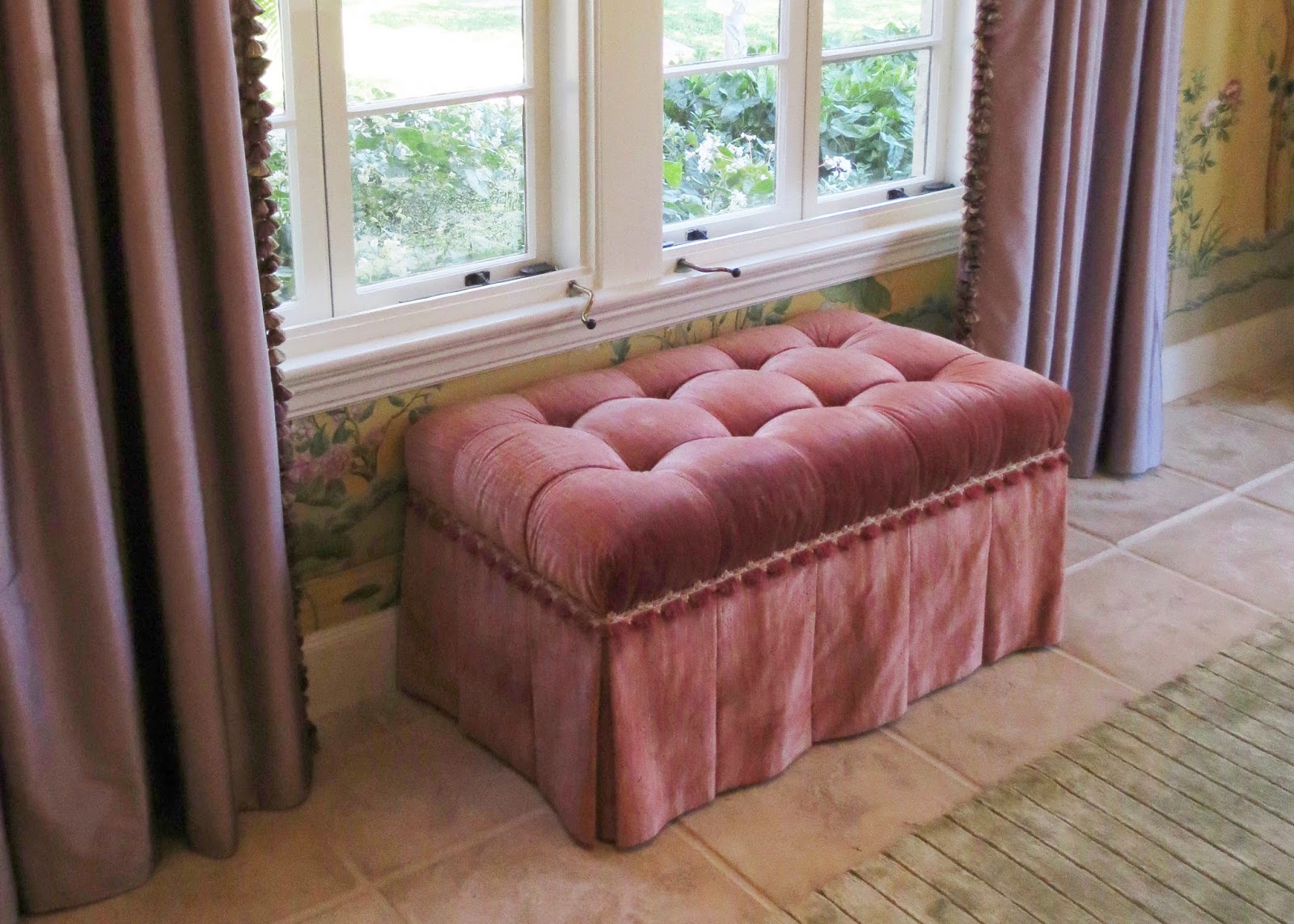
| The muted purple silk draperies with lush tassel fringe is a soft compliment to this rose tufted ottoman, also edged with pretty trim. |
It was great to see that the designer didn't match any colors, yet all the colors were in the wallpaper. When you find a wallpaper like this it becomes and instant color scheme. You can have fun playing with them in varying shades and tints.
I hope you enjoyed spending some time in this lovely dining room. What details did you see that you will use in your next decorating project? Learning from top designers is a great way to get confidence to make changes in your own home.
Stay tuned for future posts about this incredible show house. There is much to see! Thank you to Katherine Shenaman for creating such a beautifully detailed and gracious space.
Do you like to visit designer showcase homes? What ideas have you gotten from seeing designers' model homes? As always I invite you to share your experiences and ideas in the comment box. Your comment will appear after it has been forwarded to me.
Happy Decorating!
If you would like assistance with a decorating project please contact me at pictureprettyint@aol.com


As usual, a most interesting blog! Keep them coming!!!!!
ReplyDeleteAgree, love your blogs, keep them coming!
ReplyDelete