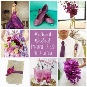
Introducing Radiant Orchid,
Pantone's Color of the Year!
Since 2000 The Pantone Color Institute has been selecting their Color of the Year. So exactly what does that mean? They seek out the color that they feel expresses in color what is taking place globally. They choose a color they feel will resonate around the world, not just in fashion but one that crosses all areas of design. It is an expression of the mood or attitude of consumers. It will influence product developement and purchasing decisions in home, fashion and industrial design.
The PCI team combs the world looking for future color influences, one that is building importance in the world of entertainment, film, art, travel destinations, lifestyles and even sporting events. And so with the new year comes their choice for 2014, Radiant Orchid.
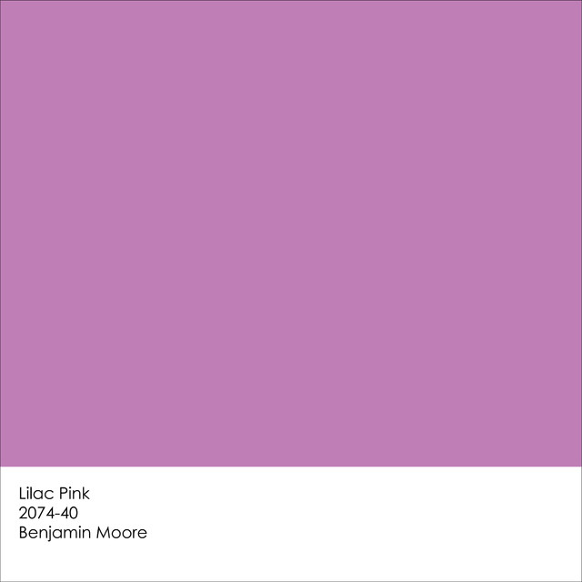
You can find a similar color in Benjamin Moore's Lilac Pink 2070-40
They describe it as enchanting, a color that encourages creativity and originality. The rosy undertones emanate joy, love and health. I think there are many interpretations of the color orchid, some more purple or violet. Others more pink and softer.
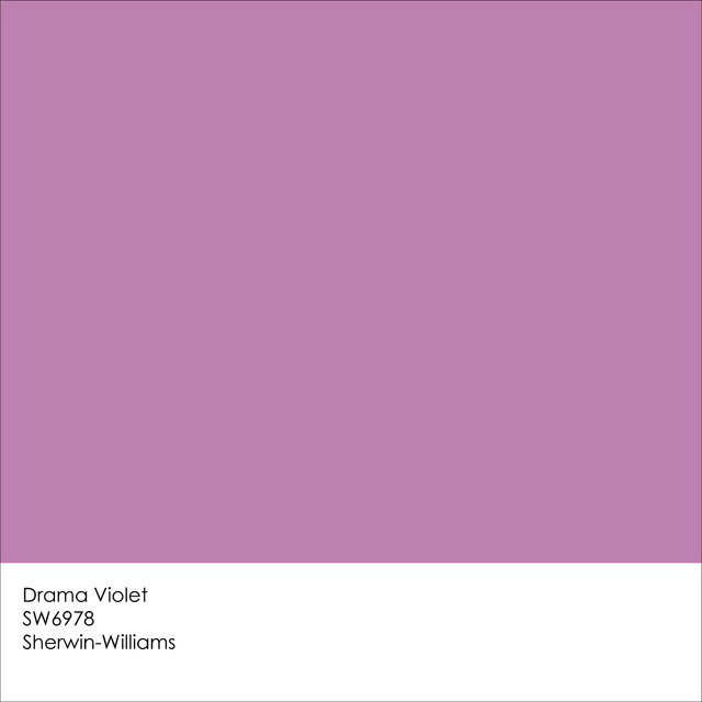
Sherwin Williams comes very close with Drama Violet SW6978.
How do we incorporate this exciting hue into interior design? How do you feel about Radiant Orchid? Is it a color you would like to paint a room?
 |
| What a dramatic color statement! |
 |
 |
 |
| A softened orchid becomes a backsplash in a contemporary kitchen. |
 |
| A deeper shade of orchid mixes well with orange and turquoise. |
I find myself looking at images of flowers, still lifes, fashion, art or accessories and thinking, that's not just a bouquet, it's a color scheme. Have you ever taken your inspiration for a color pallet for a room from something totally different?
 |
Did a stack of plates inspire this living room seating?
|
for our home.
Mixing red with orchid seemed to strong for me at first but it is a fun way to add an edgy twist. The two colors play well off each other especially in a contemporary setting.
A colorful wedding cake and fabulous French macarons could inspire a color pallet for an interior, couldn't they?
Whether muted or bold these shades of orchid work well when surrounded by neutrals. Below a simple flower may be just the thing to influence the colors for an interior.
Would you have the courage to use an orchid sink? Come to think of it where would you even find a sink this color? Is the photo of the lantern below just a photo? Can I even think that any more after writing this post?

This is just one way the image above can inspire a bedroom like this one.

Even accessories like these beautiful glass vases could be the jumping off point.


Maybe a vivid rug is where you might pull your colors from.

It all has to begin somewhere. Sometimes it can be from your own closet, art or fabric.

But really your inspiration just comes from opening your eyes and seeing what pleases you. Then you figure out how you want to use your favorite colors in your decorating. Do you want it on the larger surfaces like your walls?

Maybe you like it on your walls but not in such a grand statement.

Sometimes when I am dreaming up a color scheme and then start looking for fabrics or accessories etc to bring it to life, it is hard to find certain colors. When the color you want to incoporate into your design happens to be the Pantene Color of the Year, your treasure hunt becomes a whole lot easier!


I hope after reading this post you may find that adding Pantene's Color of the Year, Radiant Orchid to your home is not as daunting as it might have sounded at first. For me this has been an eye opener. I can't wait to introduce this incredible color to my decorating pallet. What do you think?
As always I invite you to share your ideas and experiences in the comment box below. I would enjoy hearing how you feel about Radiant Orchid. Is it your color of the year?
Happy Decorating!
(Portions of this post are taken from Pantone's website and images are courtesy of Pinterest. The Benjamin Moore and Sherwin Williams color swatches are courtesy of a Houzz post by Jennifer Ott of Jennifer Ott Interior Design)
If you need assistance with an interior design project for your home please contact me at
pictureprettyint@aol.com


What a great color. Thanks for your post.
ReplyDeleteGreat post and pictures. Lots of good ideas tool.
ReplyDeleteI didn't expect to be such a fan of this color! I love your pictures--so many ideas I would never have thought of. I do have a few favorites. I have a somewhat similar color on the walls of my study, but not quite as bold.
ReplyDeleteGreetings from Los angeles! I'm bored at work so I decided to check
ReplyDeleteout your website on my iphone during lunch break.
I enjoy the information you present here and can't wait to take a look
when I get home. I'm amazed at how quick your blog loaded on my
cell phone .. I'm not even using WIFI, just 3G .. Anyhow,
wonderful site!
Look at my web-site :: Chelsea
Appreciate this post. Will try it out.
ReplyDeleteMy page :: Article Submissions [http://dir.logicaljack.com/]
What a material of un-ambiguity and preserveness of valuable know-how regarding unpredicted feelings.
ReplyDeleteFeel free to visit my blog Bruno